Data visualisation in Base R #
Learning outcomes #
By the end of this tutorial, you should be able to
- draw and edit curves and plots in R
- perform basic interaction with R plots
- present and summarise statistical data with visualisation tools
- manage graphical windows in R
Warning: the materials here are so-called “Base R”. There are easier (and often better) ways of doing data visualisations with certain packages (such as “ggplot2” or “plotly”; see next sections).
Note that page numbers refer to the book The R Software.
Basic plot: plot() and points() functions - Pages 156-158 #
The plot() and points() functions are extremely useful for creating basic exploratory plots. Consider the data set longley (included in R). One can obtain a description of the data using the ?longley command.
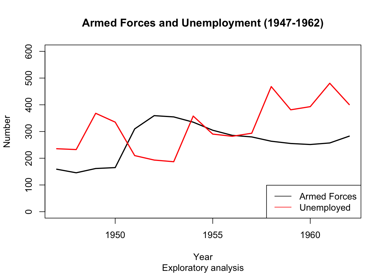
Say we are interested to find out if the number of armed forces and number of unemployed move together over time. The following graph would be useful:
So how do we create such a graph?
The plot() function #
- In R, plots are created layer by layer, so we begin with a simple plot and add elements.
- To create the simple basic plot we use the plot() function.
- The arguments are a vector of
xvalues and a vector ofyvalues.
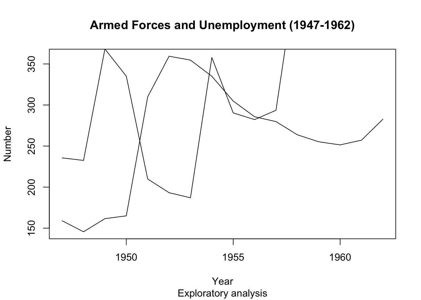
plot(longley$Year, longley$Armed.Forces)
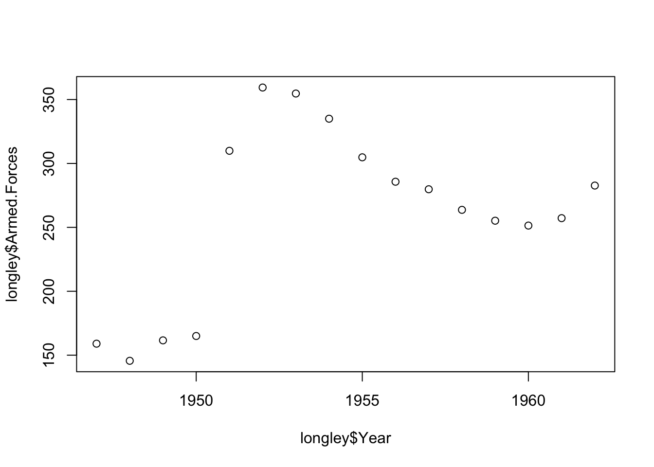
- A decent start, but could be greatly improved. What would you change about this graph?
Plot() Arguments - type #
- Time series data should generally be a line graph. We can change the plot from points to a line by changing the argument ‘type’ to “l”. By default, this was set to “p” for point. Another option is “b” for both line and point.
plot(longley$Year, longley$Armed.Forces, type="l")
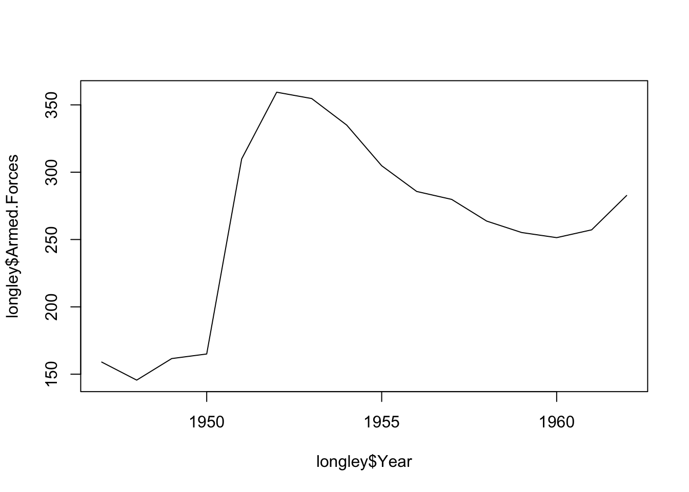
- Looking better already!
Plot() Arguments - Titles #
- Let us add some titles to improve the readability of our plot
- We would like to add axis labels, a main title and a subtitle
plot(longley$Year, longley$Armed.Forces, type="l", main="Armed Forces (1947-1962)", sub="Exploratory analysis",
     xlab="Year", ylab="Number")
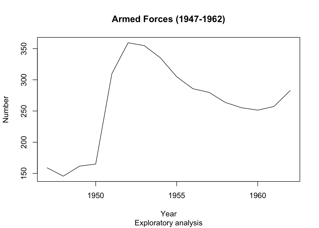
Awesome. Now let us add the second variable, Number Unemployed.
The points() function #
- The
points()function has the same basic arguments asplot(), but does not create an entirely new plot. - Instead, it adds the points to the previously created plot.
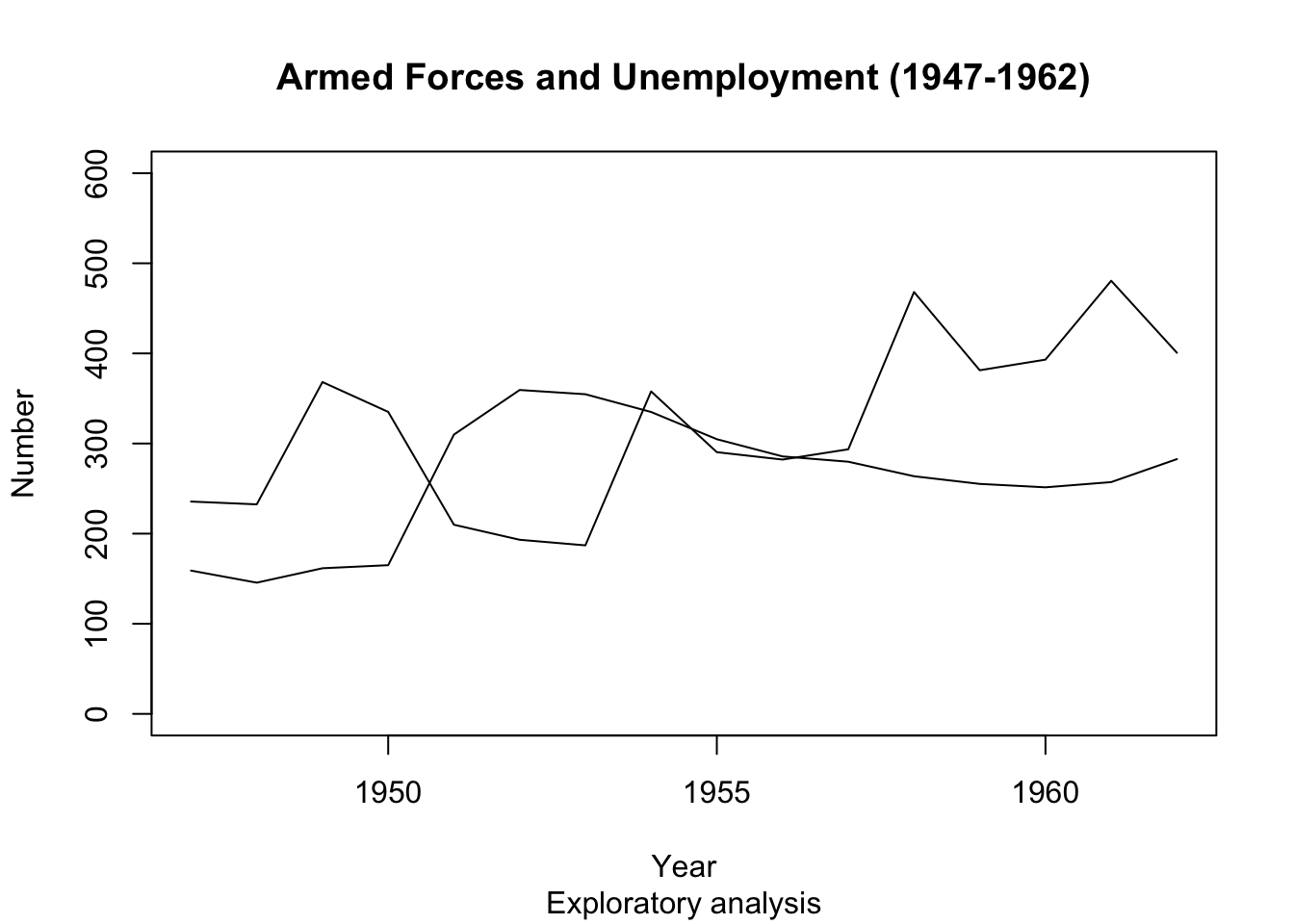
plot(longley$Year, longley$Armed.Forces, type="l", main="Armed Forces and Unemployment (1947-1962)", sub="Exploratory analysis",
     xlab="Year", ylab="Number")
points(longley$Year, longley$Unemployed, type="l")
- Oops! The
points()function does not adjust limits of the axis automatically to fit all the new data, so the new line goes off the edge of the plot.
Plot() Arguments - ylim #
- We can change the value of the ‘ylim’ argument in
plot(), to change theylimits. The input is a vector of length 2:c(min, max). - The same applies for ‘xlim’.
plot(longley$Year, longley$Armed.Forces, type="l", main="Armed Forces and Unemployment (1947-1962)", sub="Exploratory analysis",
     xlab="Year", ylab="Number", ylim=c(0,600))
points(longley$Year, longley$Unemployed, type="l")
- Better… but it’s still difficult to distinguish between the lines. Let’s add some colour!
Plot() arguments - col #
- Use the ‘col’ option to choose a colour note the syntax: you need to specify the colour by a string, e.g.
col = 'red'). - We also make the lines broader by using argument
lwd = 2, for ‘line width’.
plot(longley$Year, longley$Armed.Forces, type="l", lwd = 2, main="Armed Forces and Unemployment (1947-1962)", sub="Exploratory analysis",
     xlab="Year", ylab="Number", ylim=c(0,600))
points(longley$Year, longley$Unemployed, type="l", lwd = 2, col="red")
-
There is a wide range of colours built into R. You can use Google to find them!
-
For reference, the colors() function also returns the names of the 657 colours known to R. For example, if you want to get the different shades of orange, you can use the instruction:
colors()[grep("orange",colors())]
[1] “darkorange” “darkorange1” “darkorange2” “darkorange3” “darkorange4”
[6] “orange” “orange1” “orange2” “orange3” “orange4”
[11] “orangered” “orangered1” “orangered2” “orangered3” “orangered4”
legend() function #
- The last missing piece is a legend to help explain which line is which.
- the legend() function does this for us.
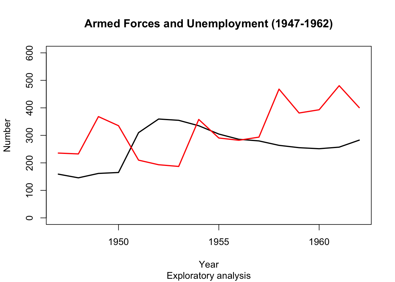
plot(longley$Year, longley$Armed.Forces, type="l", lwd = 2, main="Armed Forces and Unemployment (1947-1962)", sub="Exploratory analysis",
     xlab="Year", ylab="Number", ylim=c(0,600))
points(longley$Year, longley$Unemployed, type="l", lwd = 2, col="red")
legend('bottomright', legend=c("Armed Forces","Unemployed"), col=c("black","red"), lty=c(1,1))

Any trends here?
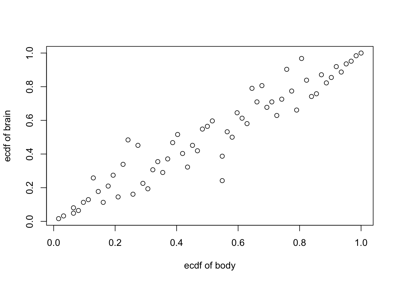
Empirical Copula #
Beside the log-transformation, a good way to scale down big observations is to use function ecdf() and draw the empirical copula (a standardised repartition of the pairs of data points, to a \([0,1]\times [0,1]\) rectangle) of a paired dataset
attach(mammals)
plot(ecdf(body)(body),ecdf(brain)(brain), xlab = "ecdf of body", ylab = "ecdf of brain" )
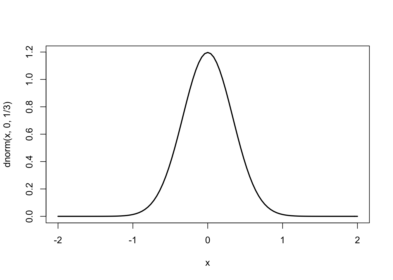
Basic plot: the curve() function - Pages 162 #
- To draw a curve (given by a function of
x) on the interval specified by the boundsfromandto
curve(dnorm(x, 0, 1/3), from=-2, to=2, lwd = 2)
curve(x*sin(1/x), from =-1/10, to=1/10, lwd = 2)
## Warning in sin(1/x): NaNs produced
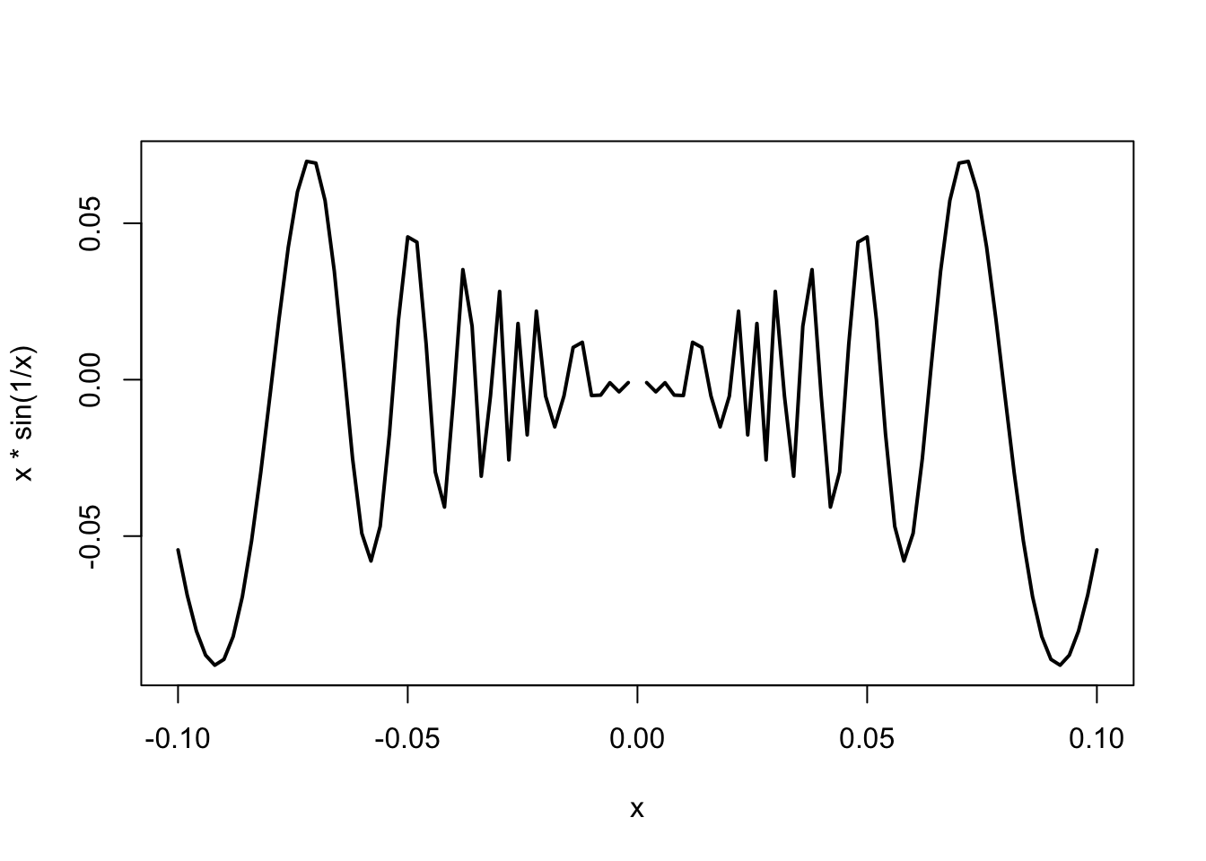
- The previous plot does not look very good: it is too ‘rough’. This has a quick fix!
# with argument 'n' we raise the # of points at which the function is evaluated (improves resolution)
curve(x*sin(1/x), from =-1/10, to=1/10, lwd = 2, n = 500)
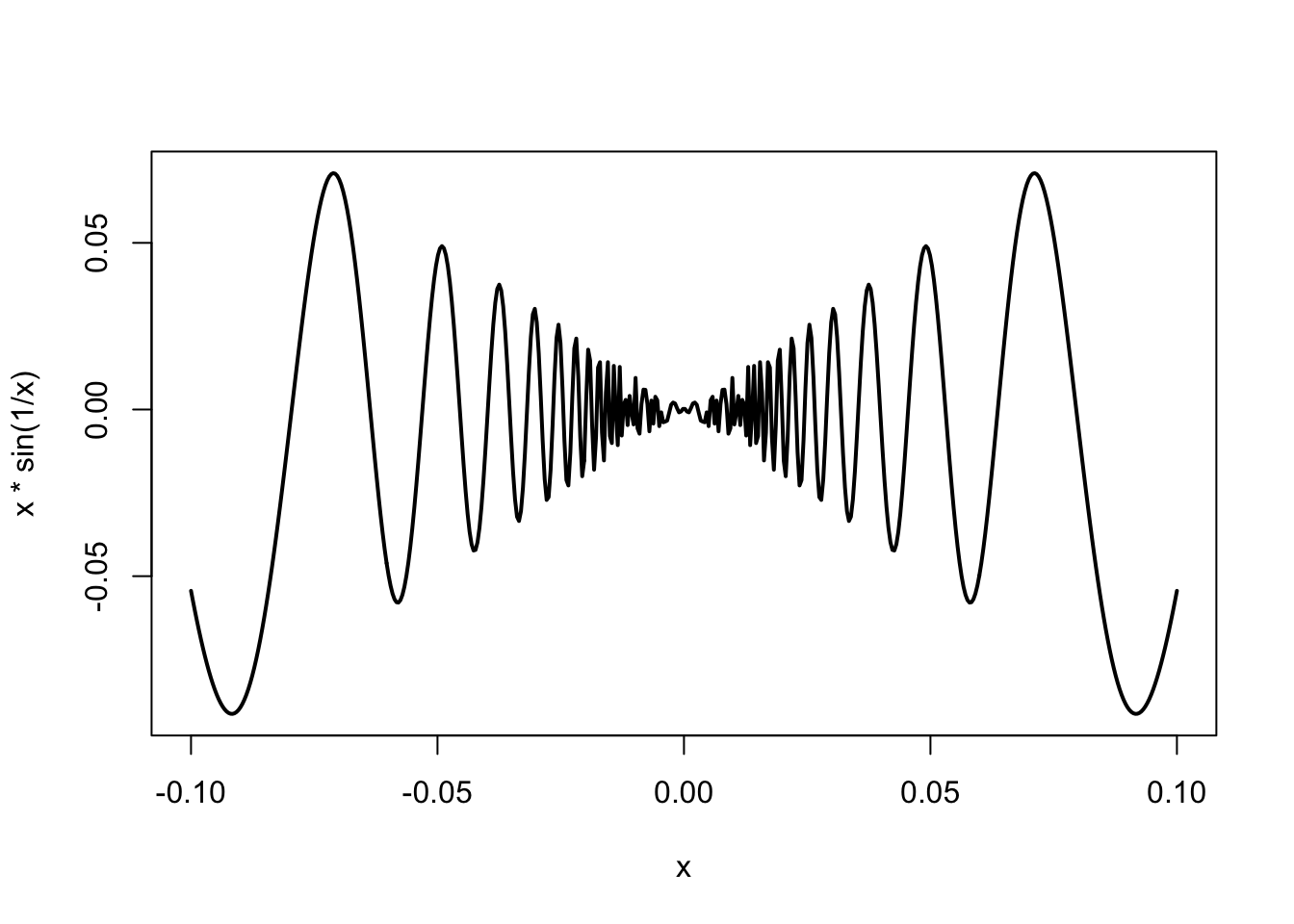
- Note also the use of argument
lwdthat makes the lines bigger
Basic plot: adding text - Page 169-170 #
- Let’s take a look at possible improvements of our plots, such as adding text and mathematical expressions or changing margins.
- Take a careful look at the code and identify which line has added which element.
# set margins of the graph (order: bottom, left, top, and right). The default is c(5.1, 4.1, 4.1, 2.1).
par(mar=c(5,5,2,2))
curve(x*sin(1/x), from =-1/10, to=1/10, lwd = 2, n = 500, col = "darkblue", xlab=expression(theta[i]), ylab=expression(y[i]), cex.lab = 2)
text(0, -0.05, "Fun with R", cex = 1.5, col = "purple")
text(0, 0.05, expression(y==theta*sin(1/theta)))
p <- 4
text(0, -0.075, bquote(beta[.(p)]), cex = 2)
mtext("Marginal text", side=4)
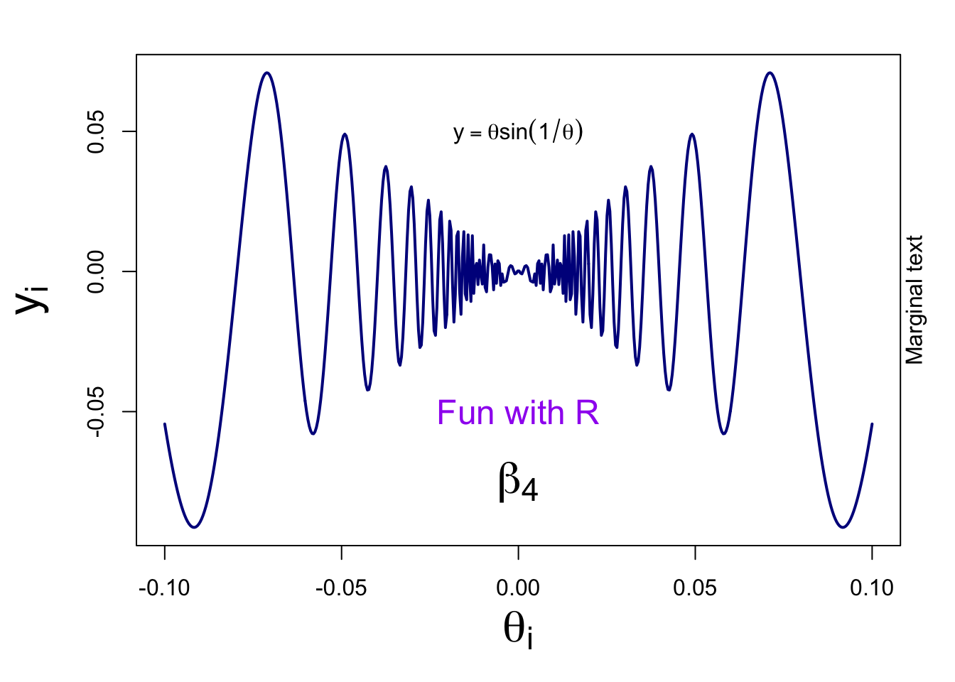
Notes:
- argument ‘cex’ allows you to change the size of elements
- we used a R expression to create math notations
- a bquote is useful when your math expression is dependent on the value of a variable (here the value of p is displayed)
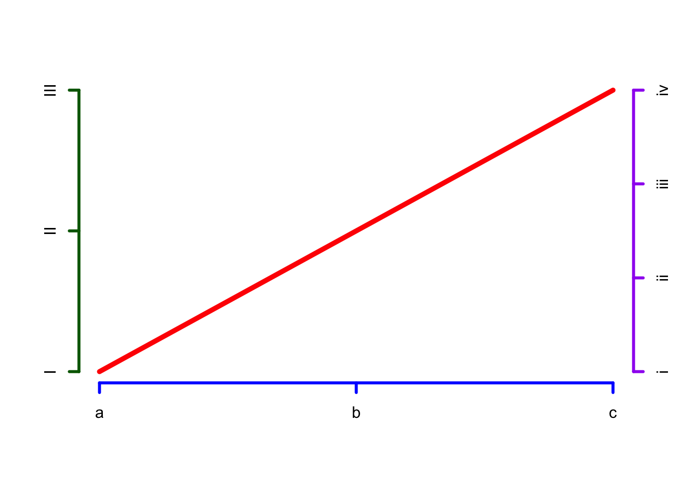
Basic plot: axes - Page 172-173 #
plot.new()
lines(x=c(0,1), y=c(0,1), col="red", lwd = 5)
axis(side=1, at=c(0, 0.5, 1), labels=c("a","b","c"), col="blue", lwd = 3)
axis(side=2, at=c(0, 0.5, 1), labels=c("I","II","III"), col="darkgreen", lwd = 3)
axis(side=4, at=c(0, 0.333, 0.667, 1), labels=c("i","ii", "iii", "iv"), col="purple", lwd = 3)
Statistical visualisation: other types of charts #
-
R has a wide range of built-in functions that can be used to visualise data. Knowing/using them will save you time, compared to coding yourself complex statistical plots from scratch.
-
In the next few sections we use the same dataset as the textbook (reformatted as
sample_data.csv) for illustration purposes.
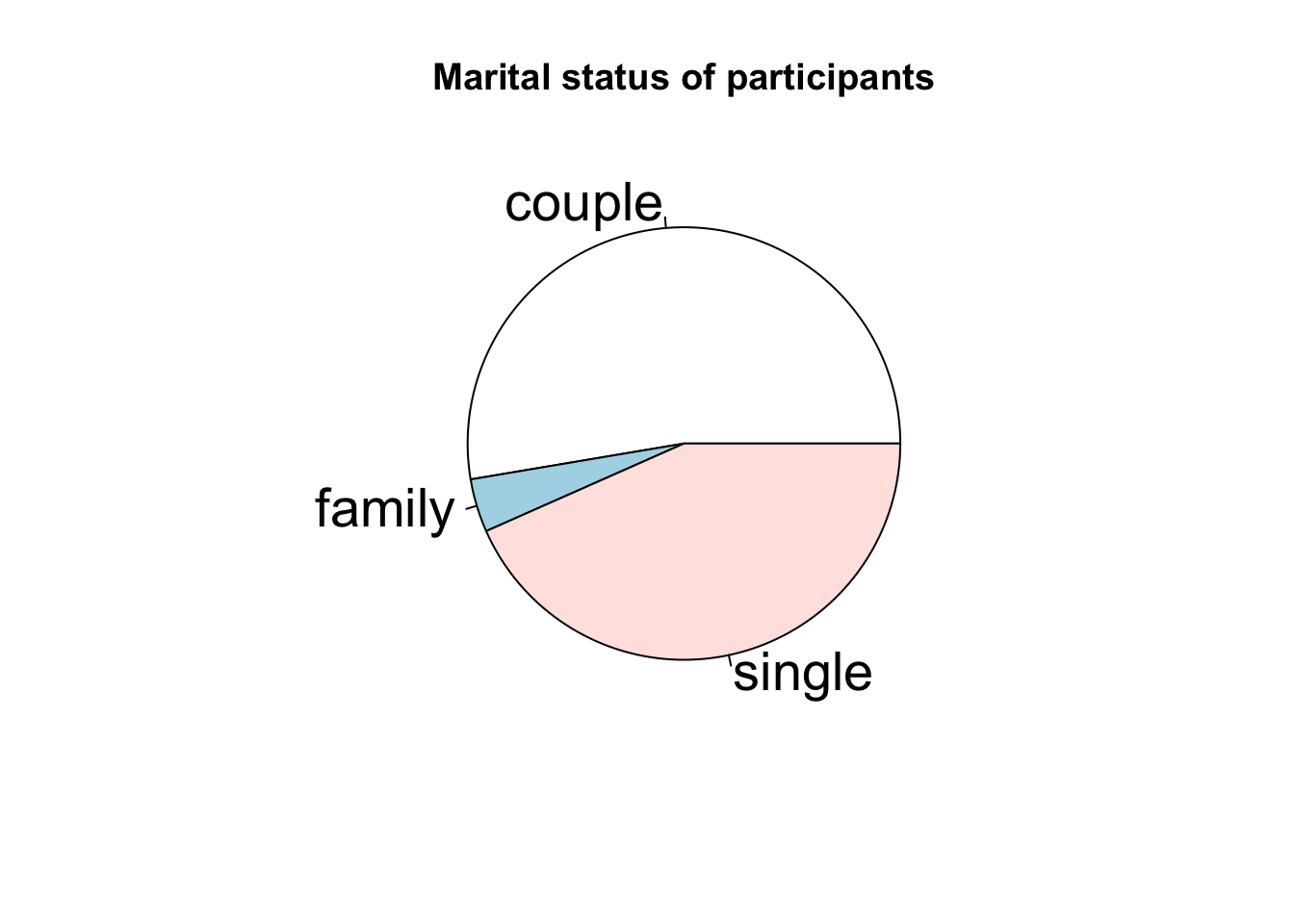
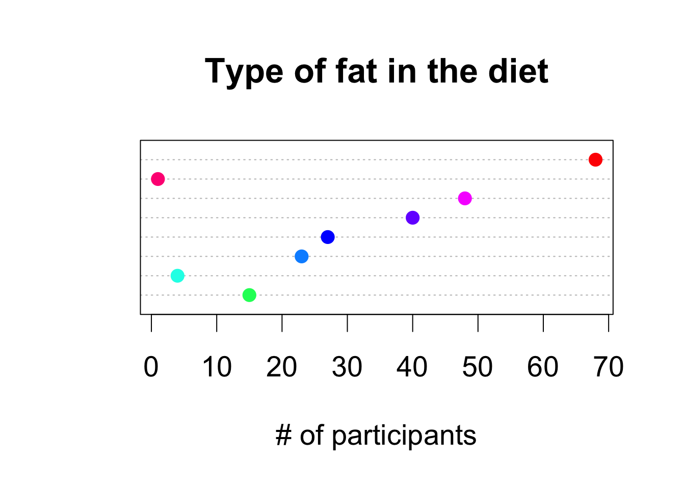
Statistical visualisation - qualitative/discrete variables - Pages 358,362 #
pie(table(situation), cex = 1.75, main = 'Marital status of participants')
dotchart(as.numeric(table(fat)), col = rainbow(8, start = 0.4, end = 1), labels=levels(fat), pch = 19, cex = 1.75, xlab = '# of participants', main = 'Type of fat in the diet')
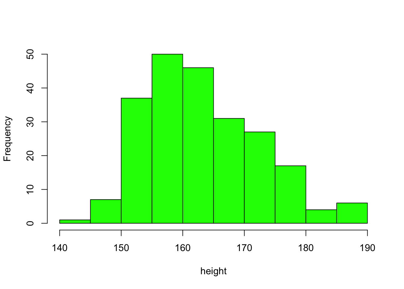
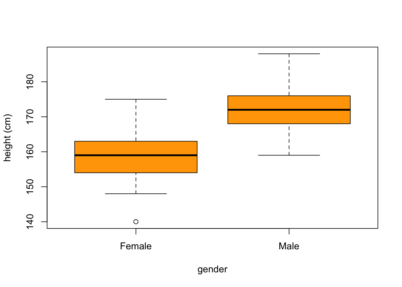
Statistical visualisation - continuous variables - Pages 366,369 #
hist(height,col="green",main="")
boxplot(height ~ gender, col="orange", xlab = 'gender', ylab = 'height (cm)')
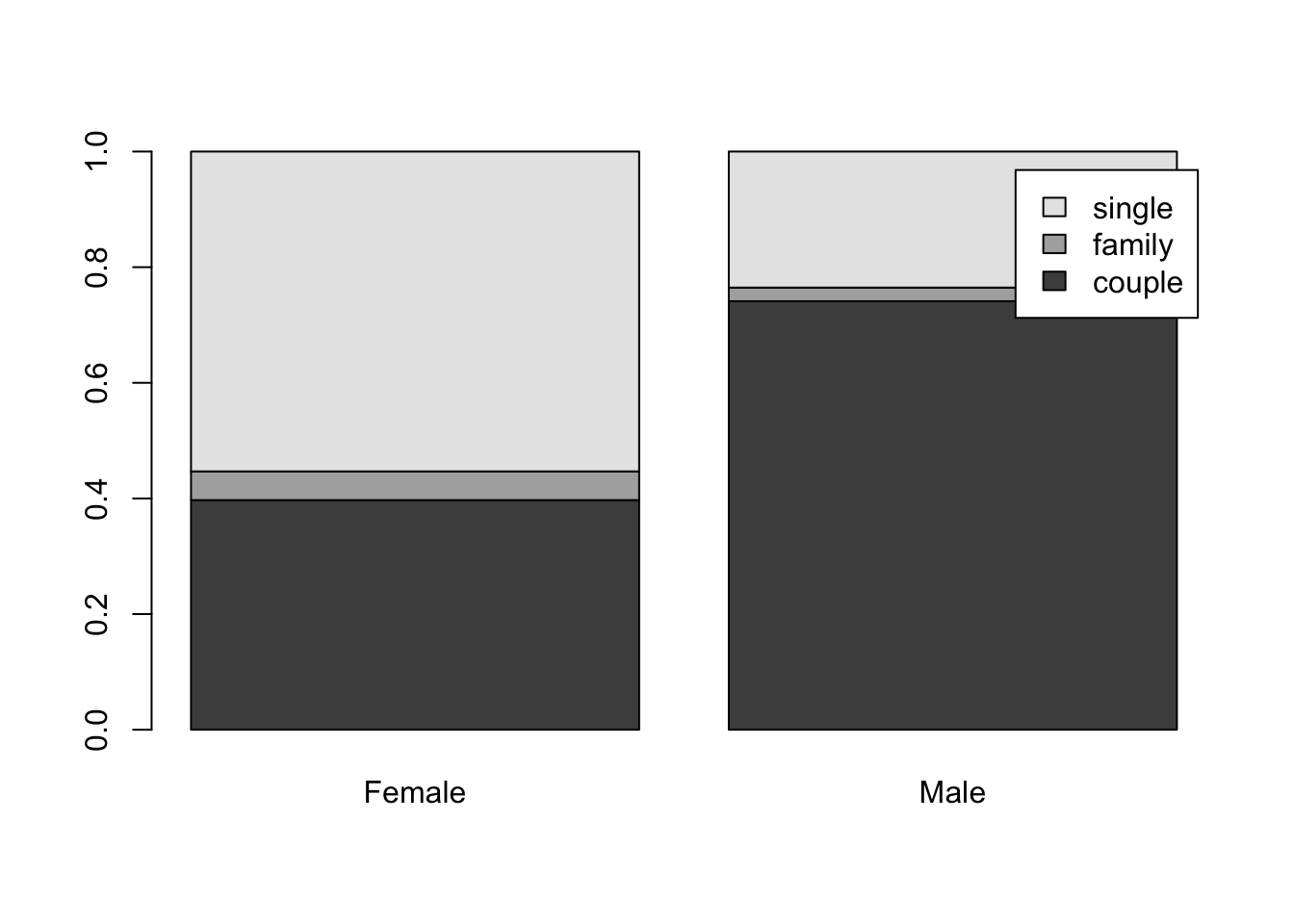
Statistical visualisation - bivariate qualitative variables - Pages 371-372 #
# turn a contingency table into a proportions table
tss <- prop.table(table(situation, gender), 2)
barplot(tss,bes=T,leg=T)
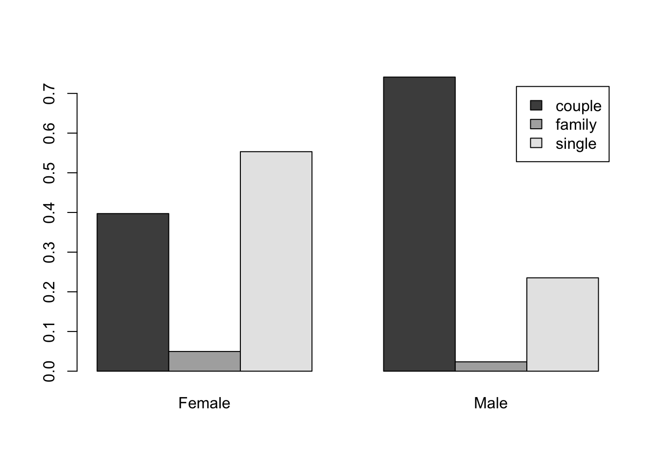
barplot(tss,bes=F,leg=T)
Adding a legend (Page 173-174) #
set.seed(1)
hist(rnorm(10000, -3, 1), breaks = 50, prob = T, col = "lightblue", xlab = "", xlim = c(-8, 8), main = "Two empirical distributions")
hist(rnorm(10000, 3, 1), breaks = 50, prob = T, col = "blue", add =T)
curve(dnorm(x, -3, 1), lwd = 3, add = T, col = "red")
curve(dnorm(x, 3, 1), lwd = 3, add = T, col = "red")
legend("topright", ncol = 1, cex = 1.5, legend=c("Sample 1", "Sample 2"), fill=c("lightblue", "blue"))
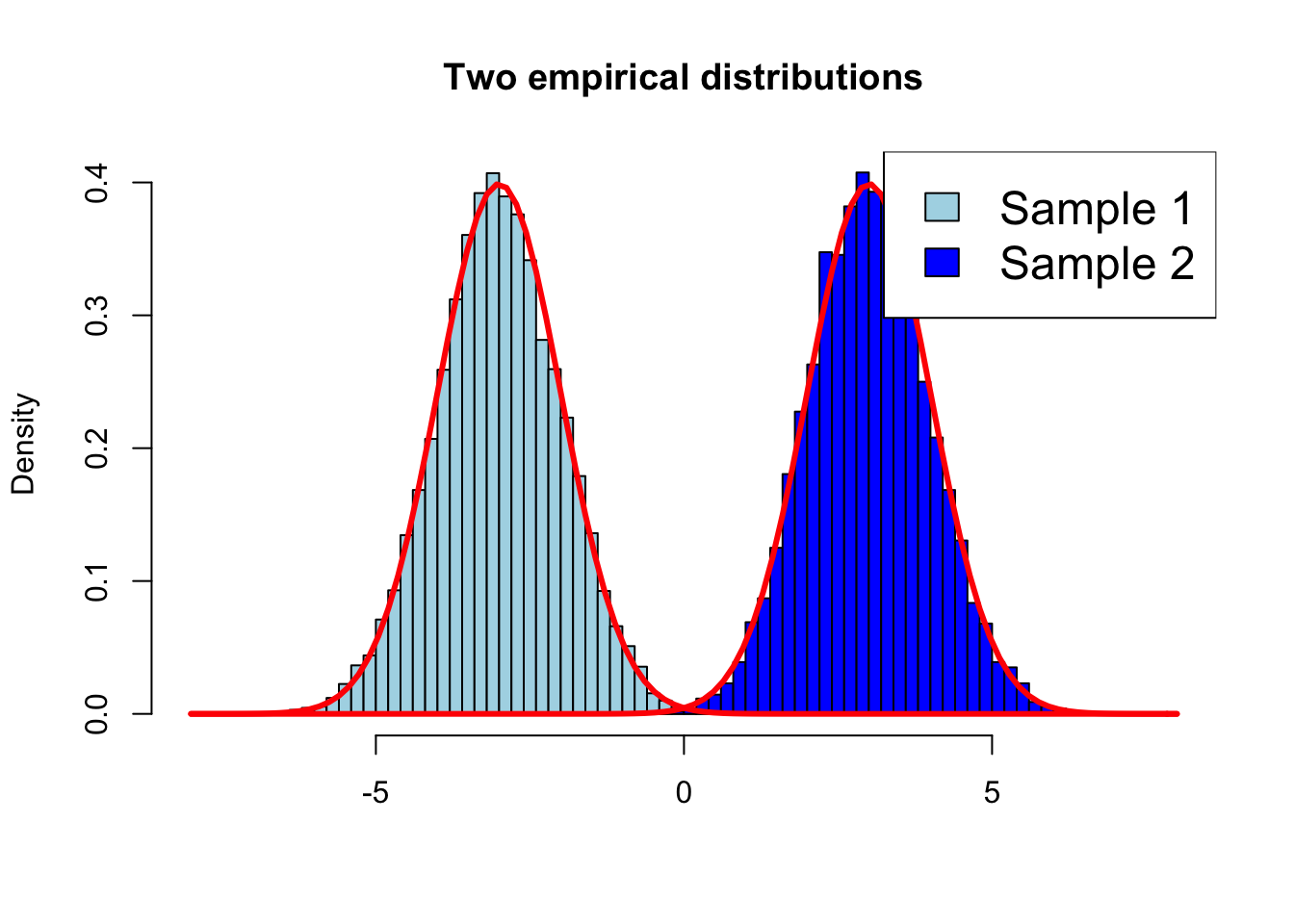
Notes:
- With argument ‘xlab’ we force the range of ‘x’ values to be what we want
- Argument
prob = TRUEmeans the histogram is on a probability scale (not a count scale), and hence you can directly compare it to a theoretical pdf (the Normal in this case)
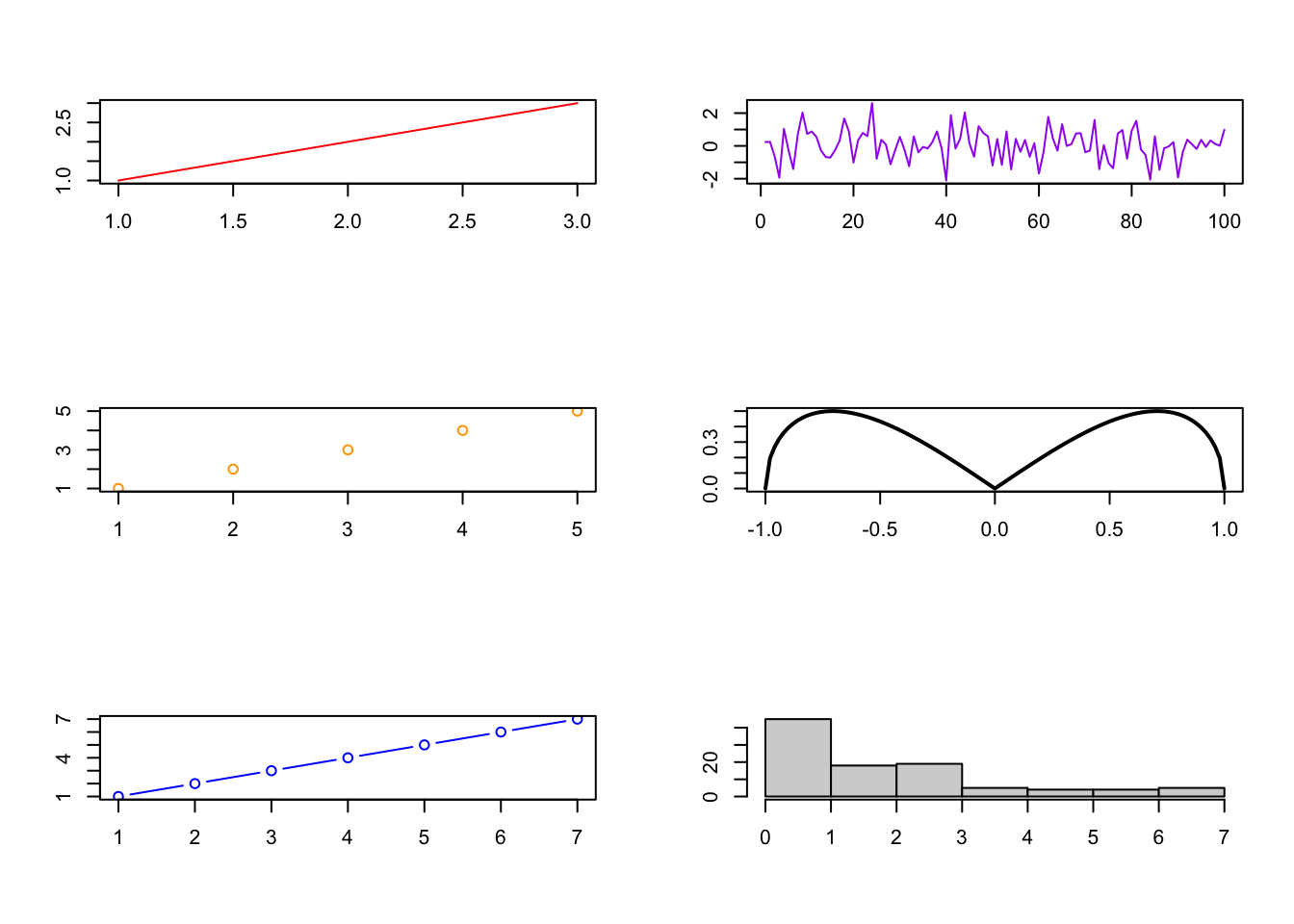
Graphical windows - Splitting the Graphics Window - Page 154 #
You can easily have several plots (of possibly different types) in one plot, as below.
# Split the window to have 3 lines and 2 columns of plots (to be filled by column)
par(mfcol=c(3,2))
# First plot
plot(1:3,1:3,col="red",type="l", xlab= "", ylab= "")
plot(1:5,1:5,col="orange",type="p", xlab= "", ylab= "")
plot(1:7,1:7,col="blue",type="b", xlab= "", ylab= "")
plot(ts(rnorm(100)),col="purple", xlab= "", ylab= "")
curve(sqrt(x^2 - x^4), from = -1, to = 1, lwd = 2, xlab= "", ylab= "")
hist(rexp(100,1/2), main = "", xlab= "", ylab= "")
Graphical windows - Opening, closing and saving graphical windows - Pages 151-153 #
-
To open a new graphical window, use the instructions
windows()orwin.graph()(for MacOS, usequartz()). -
To close some graphical device, use:
dev.off(device-number). -
To save a plot:
-
if the plot has already been drawn in a window, use
savePlot(filename="Rplot",type="pdf")
-
You can also specify the export plot before it is created
-
windows()
pdf(file="example12.pdf")
hist(runif(100))
dev.off()
Additional Notes #
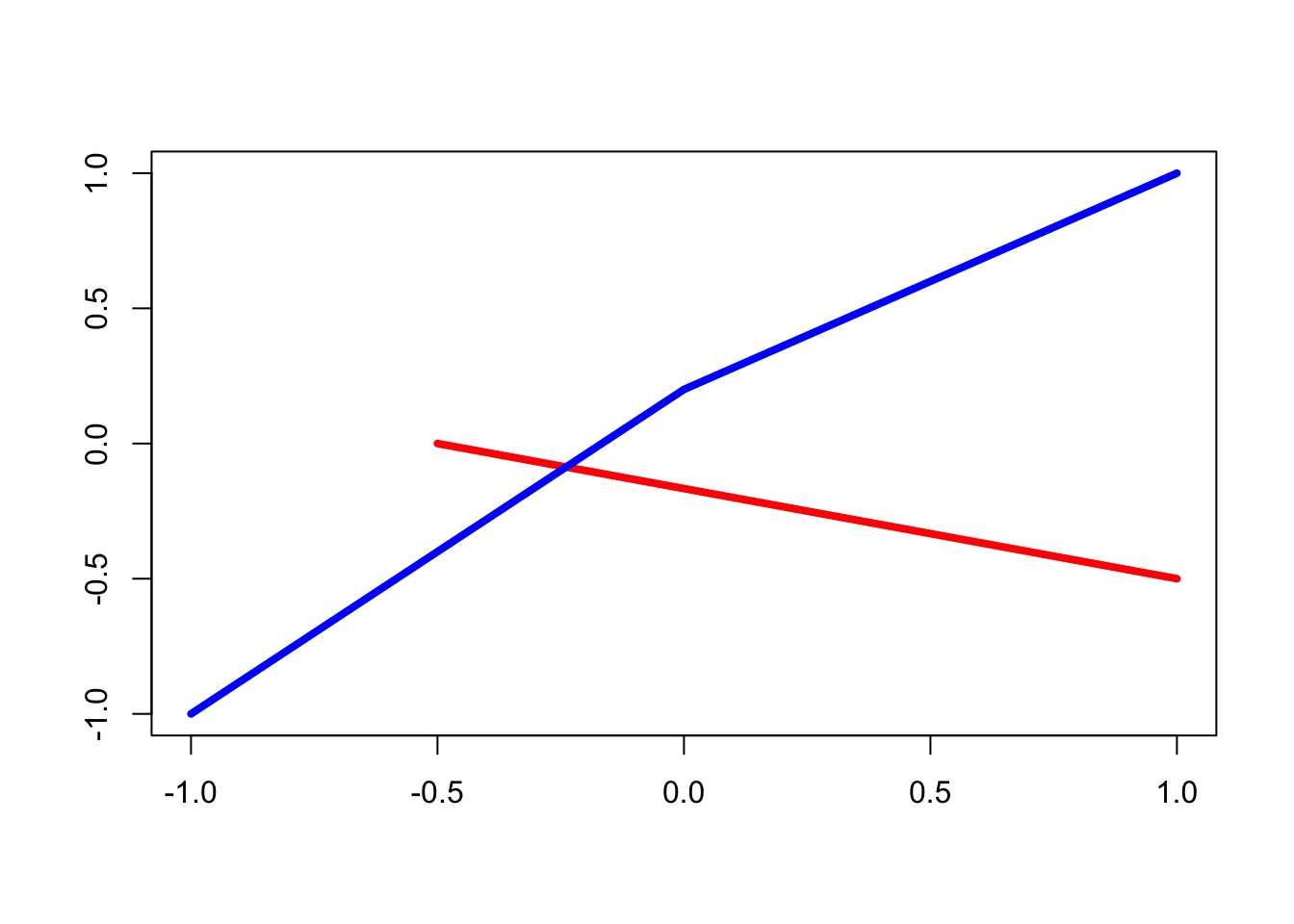
Additional Notes: the segments() and lines() functions - Pages 158-159 #
To join points with straight lines on an existing plot:
# create an empty plot
plot(0,0,"n", xlab="", ylab="")
# add a segment joining two points
segments(x0=-0.5, y0=0, x1=1, y1=-0.5, col = "red", lwd = 4)
# add two segments, joining three points: first argument is the 'x' values, second is the 'y' values
lines(c(-1,0,1), c(-1,0.2,1), col = "blue", lwd = 4)
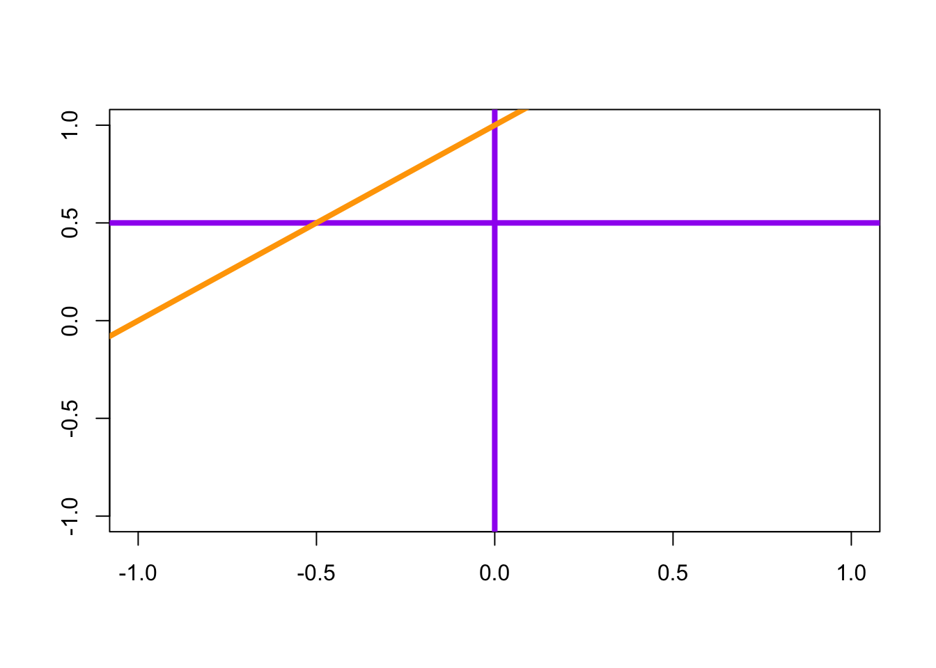
Additional Notes: the abline() function - Pages 159 #
To draw a straight line of equation \(y=a+bx\) (specified by the arguments a and b), or a horizontal line (argument h), or a vertical line (argument v)
plot(0,0,"n", xlab="", ylab="")
abline(h=0.5, v=0, col = "purple", lwd = 4)
abline(a=1, b=1, col = "orange", lwd = 4)
Additional Notes: Interacting with the plot: the locator() function - Page 175 #
The locator() function is used to place a point on a plot, or to get its coordinates with a click of the mouse. It can also be useful to add text (or a caption) at a specific location, thanks to the mouse.
# Enter the following instructions, then click anywhere on the plot.
plot(1,1, xlab = "", ylab = "")
text(locator(1), labels="What a cool dot!")
Additional Notes: Interacting with the plot: the identify() function - Page 175 #
The identify() function is used to identify and mark points already present on a plot.
# Enter the following instructions, then click next to points on the plot. Use ESC to exit the interactive mode.
plot(swiss[,1:2])
x <- identify(swiss[,1:2], labels=rownames(swiss))
x
Relevant Exercises #
- 7.1-7.16, 11.14-11.18