htmlwidgets - plotly #
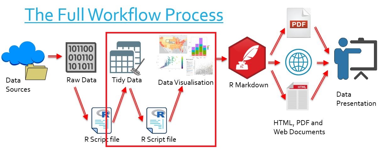
The Bigger Picture #
In this document we learn how to create interactive charts with plotly. Simply put, we are learning how to transform tidy data into visually clear graphs. In the overall context of the workflow, this falls into the category of transforming our data into data visualisation.
What is plotly? #
library("tidyverse")
library("plotly")
- An htmlwidget used to make interactive graphs and charts of several types
- Bar graphs
- Scatterplots
- Line plots
- Pie charts
- Bubble charts
- Geoplots
- And many more
- The package is bound to the plotly library in JavaScript
- Plotly heavily depends on the pipeline (
%>%) operator to create charts
Upgrading ggplot graphs with plotly #
Let’s say we have a nice graph created with ggplot2:
library("ggplot2")

load("tidy_ACORN-SAT_data/station_data.rdata")

temp_chart <- station_data %>%
  filter(Station.name == "Sydney") %>%
  ggplot(aes(x = year,
             y = average.temp)) +
  geom_point(color = "red") +
  scale_x_discrete(breaks = seq(1910, 2010, by = 10)) +
  ggtitle("Sydney's Average Yearly Temperature") +
  xlab("Year") +
  ylab("Average Temperature (°C)")

temp_chart
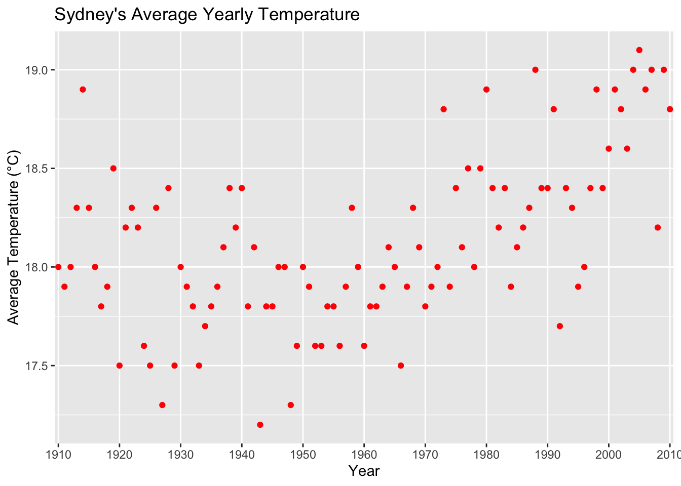
There is a useful command ggplotly() to automatically convert this to an interactive plotly widget:
ggplotly(temp_chart)
Try using your mouse to test the interactivity!
Creating Bar Charts #
Why do we use bar charts? #
- Bar charts one useful form of quantitative data visualisation.
- For each pair of variables, a bar represents one observation, meaning we can easily compare observations by seeing which one is taller
- For example, it becomes easy to visualise the heights of some different coloured aliens with a bar graph!
##
## ── Column specification ────────────────────────────────────────────────────────
## cols(
##   name = col_character(),
##   colour = col_character(),
##   height = col_double(),
##   weight = col_double()
## )
How do we make bar charts? #
For our examples we will use the same data from the Australian Environmental-Economic Accounts (2016), now including data from 2008-2014. The data relates to water consumption by state.
load(file = "tidy_EnvAcc_data/consumption.rdata")
consumption
## # A tibble: 48 x 3
##    State year    water_consumption
##    <chr> <chr>               <dbl>
##  1 NSW   2008–09              4555
##  2 VIC   2008–09              2951
##  3 QLD   2008–09              3341
##  4 SA    2008–09              1179
##  5 WA    2008–09              1361
##  6 TAS   2008–09               466
##  7 NT    2008–09               160
##  8 ACT   2008–09                48
##  9 NSW   2009–10              4323
## 10 VIC   2009–10              2904
## # … with 38 more rows
- We begin by piping our data into a function,
plot_ly()
consumption %>%
  plot_ly()
Already our chart is “interactive”: we can use our mouse to select specific areas of the empty graph, however we have no data.
add_trace()is a key plotly function that configures our graphs- The function has literally hundreds of arguments (one can read about each of them here)
- We can be content learning a few
consumption %>%
  group_by(year) %>%
  summarise(consumption_total = sum(water_consumption)) %>%
  plot_ly() %>%
  add_trace(x = ~year,
            y = ~consumption_total,
            type = "bar")
- Notice that we use a tilde (“
~”) when calling on columns from our data - Plotly requires this syntax in order to understand what variables refer to our data columns
We have made a generic bar graph based on total water consumption per year, but what if we want a more advanced bar graph?
- We can pipe our existing graph into
layout() - This function also has many arguments (also found here!)
- We select arguments depending on the type of graph we are creating
Now we want a stacked bar chart, showing the breakdown of which state consumed water in a given year
- We change the
barmodelayout option to “stack” - We add in a
colorargument of trace to colour stack sections by variable
consumption %>%
  plot_ly() %>%
  add_trace(x = ~year,
            y = ~water_consumption,
            type = "bar",
            color = ~State) %>%
  layout(barmode = "stack")
- If we wish to display proportion rather than quantity, we use the
layout()argumentbarnorm
consumption %>%
  plot_ly() %>%
  add_trace(x = ~year,
            y = ~water_consumption,
            type = "bar",
            color = ~State) %>%
  layout(barmode = "stack",
         barnorm = "percent")
Mouse over the graph to see information!
- But what if we want a horizontal bar chart?
consumption %>%
  plot_ly() %>%
  add_trace(x = ~water_consumption,
            y = ~year,
            type = "bar",
            color = ~State) %>%
  layout(barmode = "stack",
         barnorm = "percent")
It is an exercise for the careful reader to deduce what part of the code was modified!
Creating Scatter Charts #
Why do we use scatter charts? #
- Scatter charts are used to plot many data points for two variables
- These charts often aim to show the relationship between these variables by demonstrating trends in the data
How do we make scatter charts? #
For our examples we will use data from the ABARES Agricultural Census of 2015-2016. The data relates to the average climate-adjusted productivity of all cropping farms between 1977 and 2015.
load("tidy_ABARES_data/farm_data.rdata")
head(farm_data, n=5)
## # A tibble: 5 x 4
##   year  Total.factor.productivity Climate.effect Climate.adjusted.TFP
##   <chr>                     <dbl>          <dbl>                <dbl>
## 1 1978                       95.9           89.7                 103.
## 2 1979                      113.           113.                  102.
## 3 1980                      112.           106.                  103.
## 4 1981                       84.2           92.5                 101.
## 5 1982                      104.           105.                  101.
- When we plot our data, our code looks very similar to before
- We set the
typeto “scatter” - We use the new
modeargument to set to “markers”- This simply specifies that we want points on our plot
- We could set it to “lines” or “lines+markers” if we wished to connect them
- Here we have coloured the points by climate-adjusted TFP, however we would normally see points coloured by a categorical variable
farm_data %>%
  plot_ly() %>%
  add_trace(type = "scatter",
            x = ~Climate.effect,
            y = ~Total.factor.productivity,
            mode = "markers",
            color = ~Climate.adjusted.TFP)
Creating Line Charts #
Why do we use line charts? #
- Line charts are like scatterplots, except our x-axis variable is usually time
- We use line charts to measure how one variable changes over time
- It is visually useful so we can see any patterns in the data over time
How do we make line charts? #
Using the same data as before, let’s make some line charts.
- Once again our code looks very similar to before - this is the versatility of plotly
- We note that line charts are simply scatter charts with a different
mode
farm_data %>%
  plot_ly() %>%
  add_trace(type = "scatter",
            x = ~year,
            y = ~Total.factor.productivity,
            mode = "lines")
- If we want to play around with colour, we can use the
markerandlinearguments - Each take a list of options, and we can change their colour with
colorthis way
farm_data %>%
  plot_ly() %>%
  add_trace(type = "scatter",
            x = ~year,
            y = ~Total.factor.productivity,
            mode = "lines",
            marker = list(color = "Blue"),
            line = list(color = "Red"))
Creating Bubble Charts #
Why do we use bubble charts? #
- Bubble charts are useful in similar ways to scatter charts, but they convey even more information
- Bubble charts have an additional element - size - that can be used to visually represent a third variable
- A common usage is to visualise data to do with countries or cities, with the size element reflecting population
How to we make bubble charts? #
- Bubble charts are simply scatter plots with resized markers
- Here we plot TFP against climate-adjusted TFP, with the climate effect as the size.
farm_data %>%
  plot_ly() %>%
  add_trace(type = "scatter",
            x = ~Climate.adjusted.TFP,
            y = ~Total.factor.productivity,
            mode = "markers",
            size = ~Climate.effect)
Additional options #
- We can add a title with the layout option
title - We can change the names of our axes with
layout()optionsxaxisandyaxisare layout options- Each of them take the value of a list, and that list contains sub-options
- We want a list where the sub-option
titleis set to whatever we like
- We can add text if we hover over our chart with the
textargument ofadd_trace()- This usually involves some variable
- We use
paste()orpaste0()to insert text and a variable - Remember the tilde (“
~”)!
farm_data %>%
  plot_ly() %>%
  add_trace(type = "scatter",
            x = ~year,
            y = ~Total.factor.productivity,
            mode = "lines",
            text = ~paste0("Climate effect is: ", Climate.effect)) %>%
  layout(title = "Total Factor Productivity over Time",
         xaxis = list(title = "Time"),
         yaxis = list(title = "Total Factor Productivity"))
- If we hover over the data, we get our coordinates as well as what we specified
- If we want more precise control over what is displayed, we use the
hoverinfoargument- This allows us to say we just want the
textargument active - Note the argument takes a vector
- This allows us to say we just want the
farm_data %>%
  plot_ly() %>%
  add_trace(type = "scatter",
            x = ~year,
            y = ~Total.factor.productivity,
            mode = "lines",
            text = ~paste0("Climate effect is: ", Climate.effect),
            hoverinfo = c("text")) %>%
  layout(title = "Total Factor Productivity over Time",
         xaxis = list(title = "Time"),
         yaxis = list(title = "Total Factor Productivity"))
Combining Multiple Plots #
We can plot several graphs which share one particular axis. In this example (using farm_data) we share the x-axis, but the y-axis is just as achievable.
- We will create a vector of the variables we want to plot
- They must be referred to by column name only
- The vector must be a vector of strings
variables = c("Total.factor.productivity",
              "Climate.effect",
              "Climate.adjusted.TFP")
- We will create a function which plots one chart with plotly, using a generic dummy variable name (eg
var1)- When it comes to the axis we share, we use the shared variable
- For the other, we use
as.formula(paste0("~", var1)) - This is because we need a way of writing ~var for every variable, and then passing this into the y argument
- We also use the
nameargument ofadd_trace()to tell the function the name of our variables. This helpslapply()decide what to put on our legend in the final plot
plot1 <- function(var1) {
  farm_data %>%
    plot_ly() %>%
    add_trace(type = "scatter",
              x = ~year,
              y = as.formula(paste0("~", var1)),
              name = paste0(var1),
              mode = "lines") %>%
    layout(xaxis = list(title = "Year"),
           yaxis = list(title = "Index"))
}
- We will use
lapply()to create the same plot of all our variables at once
plots <- lapply(variables, plot1)
- We use the subplot function with very particular arguments to force these plots onto one graph
subplot(plots,
        shareX = TRUE,
        nrows = length(plots),
        titleY = TRUE)
- It is possible to tweak
nrowsto easily plot graphs next to each other, but this is visually weaker
Creating Scattergeo Plots #
We return to our ACORN-SAT data as an example
- To make a map, we begin with the
plot_geo()function instead ofplot_ly() - We set
xto be longitude, andyto be latitude
load("tidy_ACORN-SAT_data/station_data.rdata")

station_data %>%
  filter(year == 2000) %>%
  plot_geo() %>%
  add_trace(x = ~Longitude,
            y = ~Latitude,
            color = ~average.temp)
## No scattergeo mode specifed:
##   Setting the mode to markers
##   Read more about this attribute -> https://plotly.com/r/reference/#scatter-mode
Note that if we wish we may still add the argument size to our data.
There is also an opacity option which takes a numeric value.
- There are even more options with the
layout()function- They control what our map displays
- We use the
geoargument, and once again we must format it as a list
load("tidy_ACORN-SAT_data/station_data.rdata")

station_data %>%
  filter(year == 2000) %>%
  plot_geo() %>%
  add_trace(x = ~Longitude,
            y = ~Latitude,
            color = ~average.temp) %>%
  layout(geo = list(showlakes = TRUE,
                    showrivers = TRUE,
                    showcountries = TRUE))
## No scattergeo mode specifed:
##   Setting the mode to markers
##   Read more about this attribute -> https://plotly.com/r/reference/#scatter-mode
Creating Choropleths #
For our examples let us use a global surface temperature dataset obtained through Kaggle. We consider temperatures for just one day.
temperature_data <- read_csv("global_temp/GlobalLandTemperaturesByCountry.csv") %>%
  filter(dt == "2000-01-01")
To make a choropleth is relatively simple, but not extensively customiseable
- We pipe our data into
plot_geo - We specify how we determine location with the
locationmodeargument ofadd_trace()
locationmodecan take the value of “ISO-3,” “USA-states” or “country names”- The last option is usually the most useful
- ISO-3 is a method which codes regions by 3 letter codes
- We specify what column of our data contains our regional names with
locations - We specify which variable we wish to colour by using the
zargument
temperature_data %>%
  plot_geo() %>%
  add_trace(locationmode = "country names",
            locations = ~Country,
            z = ~AverageTemperature)
What happens if we don’t specify z?
- We’ll remove
zand simply specify thatcolorrefers to temperature
temperature_data %>%
  plot_geo() %>%
  add_trace(locationmode = "country names",
            locations = ~Country,
            color = ~AverageTemperature)
## No scattergeo mode specifed:
##   Setting the mode to markers
##   Read more about this attribute -> https://plotly.com/r/reference/#scatter-mode
- We learn that plotly makes a scattergeo plot with points centred on their respective country
- plotly can use
locationmodeandlocationsto create scattergeo plots without longitudes and latitudes!
Custom Colours #
Specifying custom categorical colours #
- The LinkedIn Learning tutorial specifies a lengthy method for custom categorical colours, yet a simpler and less finicky solution exists
- We use
mutate()andfactor()to strictly order how we plot our variable-to-colour (here, State) - We then specify our colours, in order, and the colour mapping will be automatic
consumption %>%
  mutate(State = factor(State,
                        levels = c("NSW", "VIC", "QLD", "SA", "WA", "TAS", "NT", "ACT"))) %>%
  plot_ly() %>%
  add_trace(x = ~year,
            y = ~water_consumption,
            type = "bar",
            color = ~State,
            colors = c("Red", "Yellow", "Pink", "Green", "Purple", "Orange", "Blue", "Violet"))
- Here, we specify the levels of our State variable (which we have made a factor)
- The order is strictly “NSW,” “VIC,” “QLD,” “SA,” “WA,” “TAS,” “NT,” “ACT”
- Then we colour by State using the
colorargument ofadd_trace() - Finally we specify the colours we wish to use in a vector using the
colorsargument ofadd_trace()- The order is strictly “Red,” “Yellow,” “Pink,” “Green,” “Purple,” “Orange,” “Blue,” “Violet”
- So we have “NSW” mapped to “Red,” “VIC” mapped to “Yellow,” etc
Specifying custom continuous colours #
- We use
colorRampPalette()to define a palette - We then specify that this is how we determine colour
palette <- colorRampPalette(c('yellow', 'red'))(length(temperature_data$AverageTemperature))

temperature_data %>%
  plot_geo() %>%
  add_trace(locationmode = "country names",
            locations = ~Country,
            z = ~AverageTemperature,
            colors = palette)