The Tidyverse - ggplot #
The Bigger Picture #
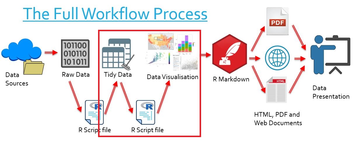
In this document we learn how to create sophisticated plots with ggplot. Simply put, we are learning how to transform tidy data into visually clear graphs. In the overall context of the workflow, this falls into the category of transforming our data into data visualisations.
What is ggplot? #
library("tidyverse")
- A chart-making package in R
- A subset of the Tidyverse, the highly regarded data manipulating package of R
- The package is used to create highly tweakable graphs, plots and charts of many varieties
- Scatterplots and line graphs
- Bar graphs and column graphs
- Histograms
- Maps
- And many more
- ggplot heavily depends on the add (
+) operator to create charts
The Grammar of Graphics #
The ‘Grammar of Graphics’ is just a method of describing graphs we create. This is more relevant to ggplot than other packages we may use because of the unique syntax required by ggplot.
For every visualisation we wish to create, we must consider its properties.
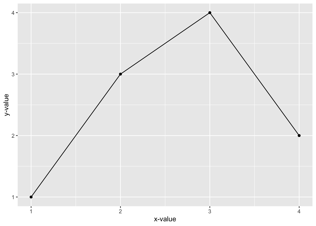
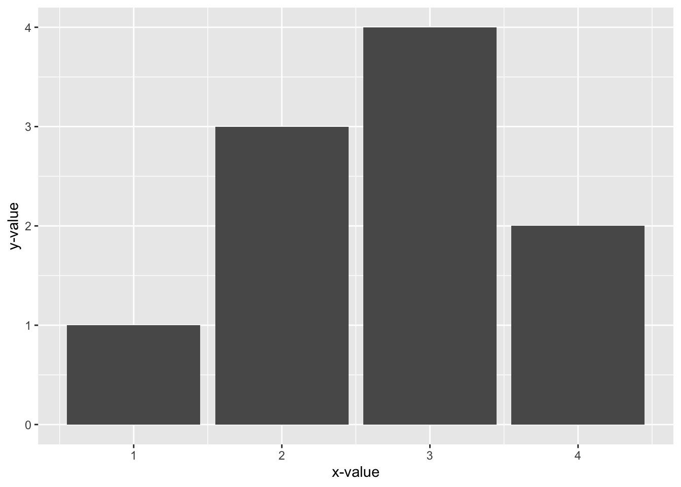
In this example, both graphs display the same data, but bar graph is very different from a scatterplot. In the bar graph, the size of a bar represents the y-value of our data, whereas in the scatterplot this is represented by the height of a point. We need a language to describe what is going on here.
We describe components of a visualisation as such:
| Component of Visualisation | Definition | Examples |
|---|---|---|
| Data | The set of data we want to visualise | Height, weight, number of… |
| Geometries | Shapes we use to visualise data | Lines, bubbles, regions… |
| Aesthetics | Properties of geometries | Thickness, size, colour… |
| Scales | Mappings between geometries and aesthetics | Thickness of a line, size of a bubble, colour of a region… |
Now we have the language we need to fully describe visualisations. One uses a point-and-line geometry, with vertical and horizontal aesthetics reflecting x- and y-values, and one uses a bar geometry, describing y-values using the height aesthetic and x-values using the label aesthetic.
ggplot() and the “add” (+) Operator
#
ggplot()
#
- Whenever we wish to make a visualisation with
ggplotwe begin withggplot() - This creates an empty plot
ggplot()
1-1.png)
- When we plot data, we note that the
ggplot()function has adataargument
We can add data in two ways:
- Directly using the argument:
ggplot(data = sample_data)
- Using the pipeline operator of the Tidyverse:
sample_data %>%
  ggplot()
3-1.png)
We note that no data is showing up. This is because we haven’t specified any method of graphing using the “add” (+) operator.
The “add” (+) Operator
#
ggplotworks by creating a plot withggplot()and then ‘add’ing to it- We specify data with
ggplot() - We then specify geometries by ‘add’ing other functions to
ggplot() - Then we can specify aesthetics using these functions
- As an example, if we ‘add’ the
geom_point()function to our ggplot using+, we will get a plot
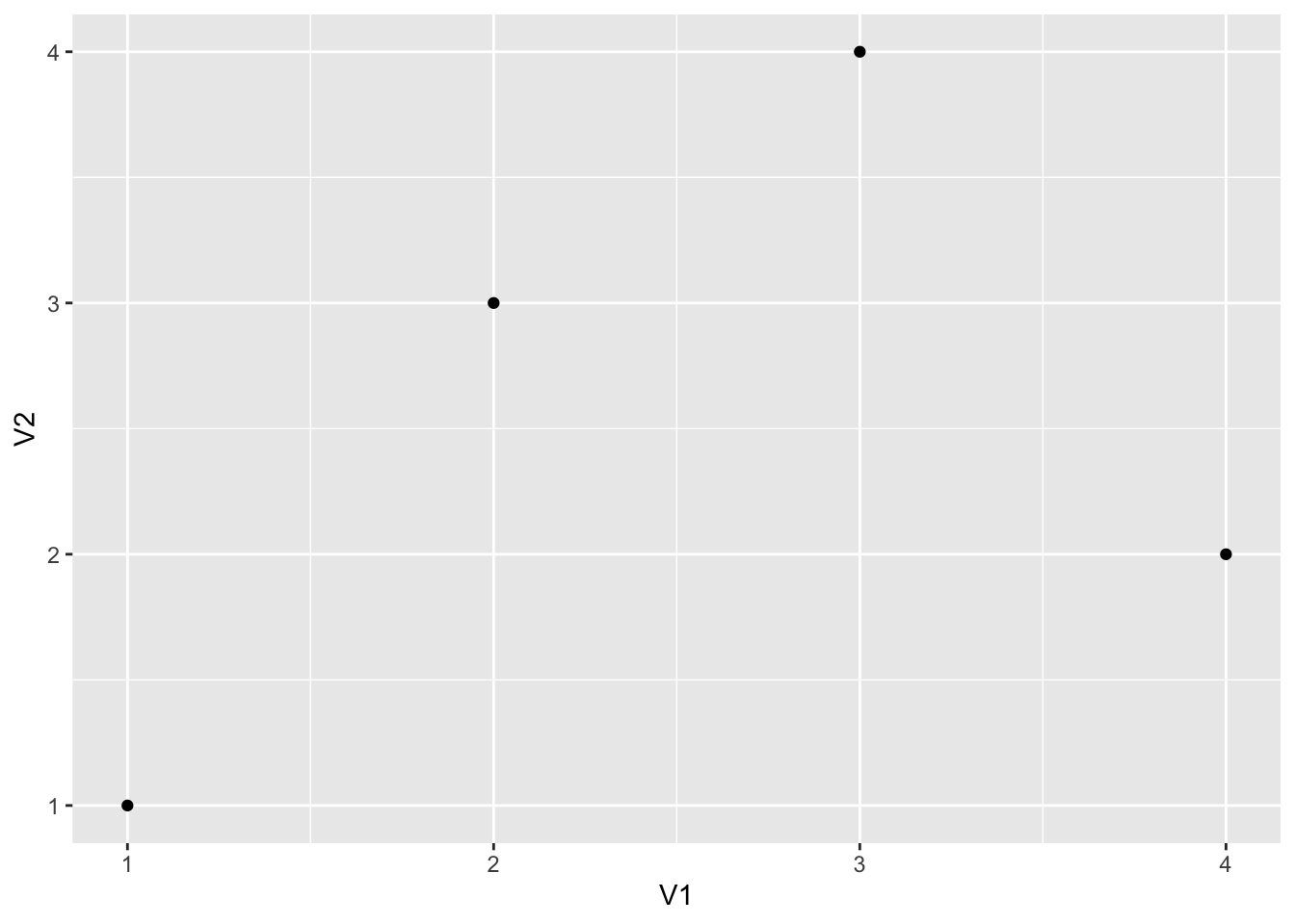
sample_data %>%
  ggplot() +
  geom_point(aes(x = V1,
                 y = V2))
- The “add” (
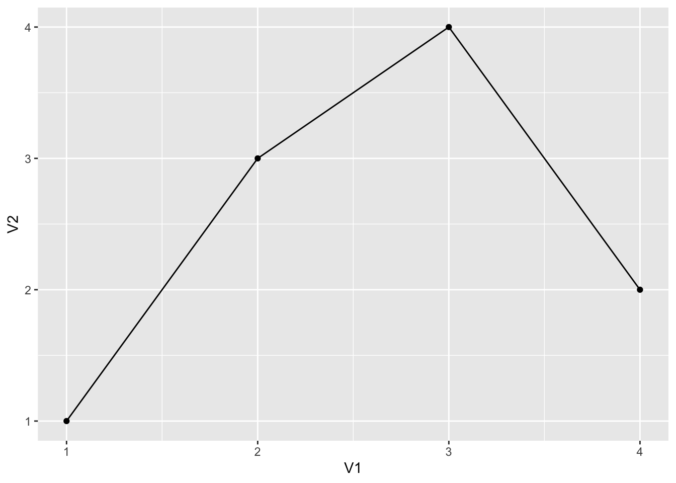
+) operator represents adding a geometry - If we wish to add another geometry, we can just use it again
- For example, if we want lines connecting these points, we can just add another geometry with the
geom_line()function
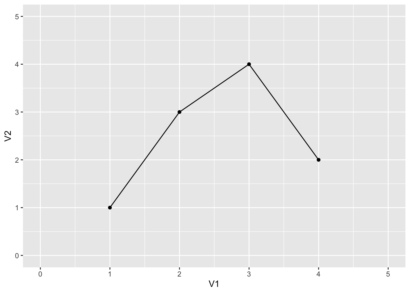
sample_data %>%
  ggplot() +
  geom_point(aes(x = V1,
                 y = V2)) +
  geom_line(aes(x = V1,
                y = V2))
Creating Scatterplots #
We will be using the [ACORN-SAT temperature data](o http://www.bom.gov.au/climate/data/acorn-sat/#tabs=Data-and-networks) for our examples.
load("tidy_ACORN-SAT_data/station_data.rdata")
sample_temperature <- station_data %>%
  filter(Station.name == "Sydney"
         | Station.name == "Darwin"
         | Station.name == "Adelaide"
         | Station.name == "Alice Springs")
head(sample_temperature, 5)
##   Number year average.temp  Station.name Latitude Longitude Elevation Start
## 1  14015 1910         26.8        Darwin   -12.42    130.89        30  1910
## 2  15590 1910         20.2 Alice Springs   -23.80    133.89       546  1910
## 3  23090 1910         15.9      Adelaide   -34.92    138.62        48  1910
## 4  66062 1910         18.0        Sydney   -33.86    151.21        39  1910
## 5  14015 1911         26.5        Darwin   -12.42    130.89        30  1910
We already know we choose data to plot using ggplot(). We know we can choose geometries using various other functions. Now we need to know how to specificy aesthetics.
- Every geometry function takes an argument called
mapping - This argument takes the value of another function, called
aes() aes()itself has arguments which control our aesthetics
For a scatterplot our geometry function is geom_point(), aes() has these arguments:
| Argument | Description |
|---|---|
| x | Data for the x-axis |
| y | Data for the y-axis |
| shape | Shape of points |
| color | Colour of points |
| size | Size of points |
There is also an argument alpha which controls the opacity of points, but this is an argument of geom_point(), not aes()
- For our graph, we can use this to plot temperature over time
sample_temperature %>%
  ggplot() +
  geom_point(aes(x = year,
                 y = average.temp))
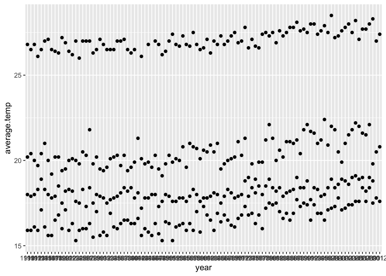
- Currently the plot looks rather disorganised - we will fix this later
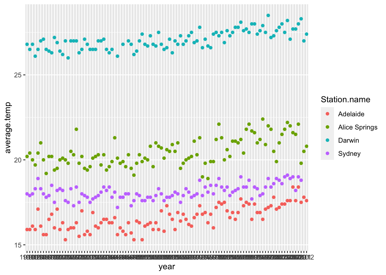
- For now we will add an aesthetic and modify the colour of points according to location
sample_temperature %>%
  ggplot() +
  geom_point(aes(x = year,
                 y = average.temp,
                 color = Station.name))
Creating Line Plots and Smoothing #
geom_line()is much likegeom_point(), but it is used to create line graphs
sample_temperature %>%
  ggplot() +
  geom_line(aes(x = year,
                y = average.temp))
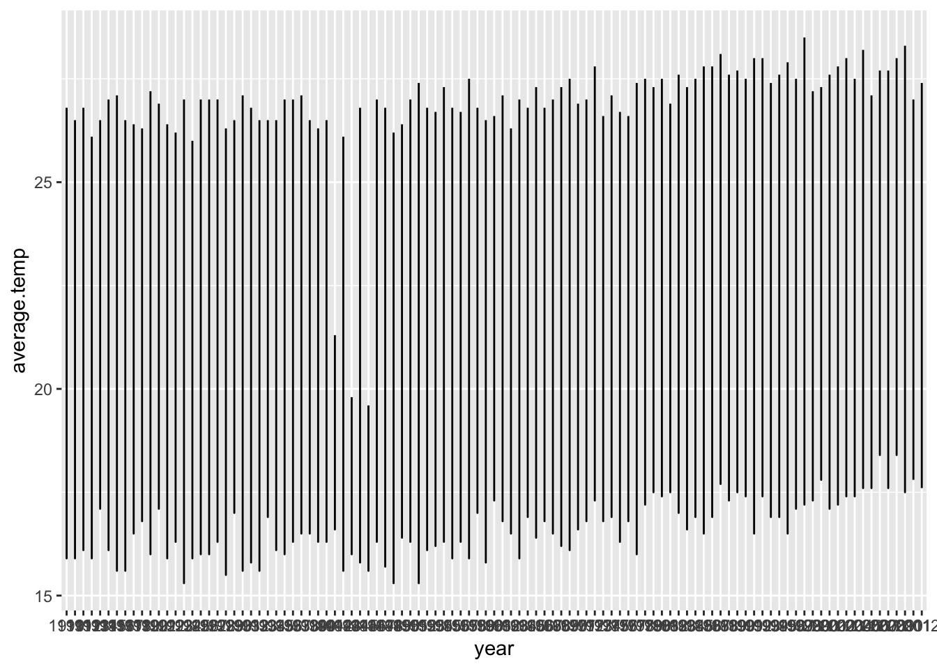
Did the plot not work?
- To use
geom_line()with multiple categories, we must tell ggplot how to group them somehow - We use the
groupargument ofaes() - Here we specify to group temperature data according to the station it comes from
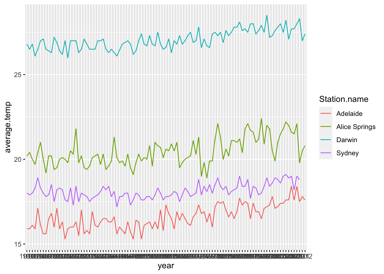
sample_temperature %>%
ggplot() +
geom_line(aes(x = year,
y = average.temp,
color = Station.name,
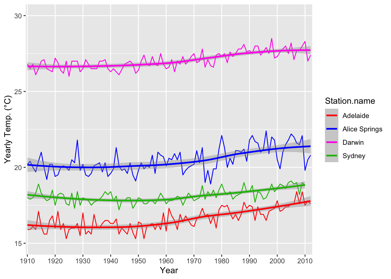
group = Station.name))
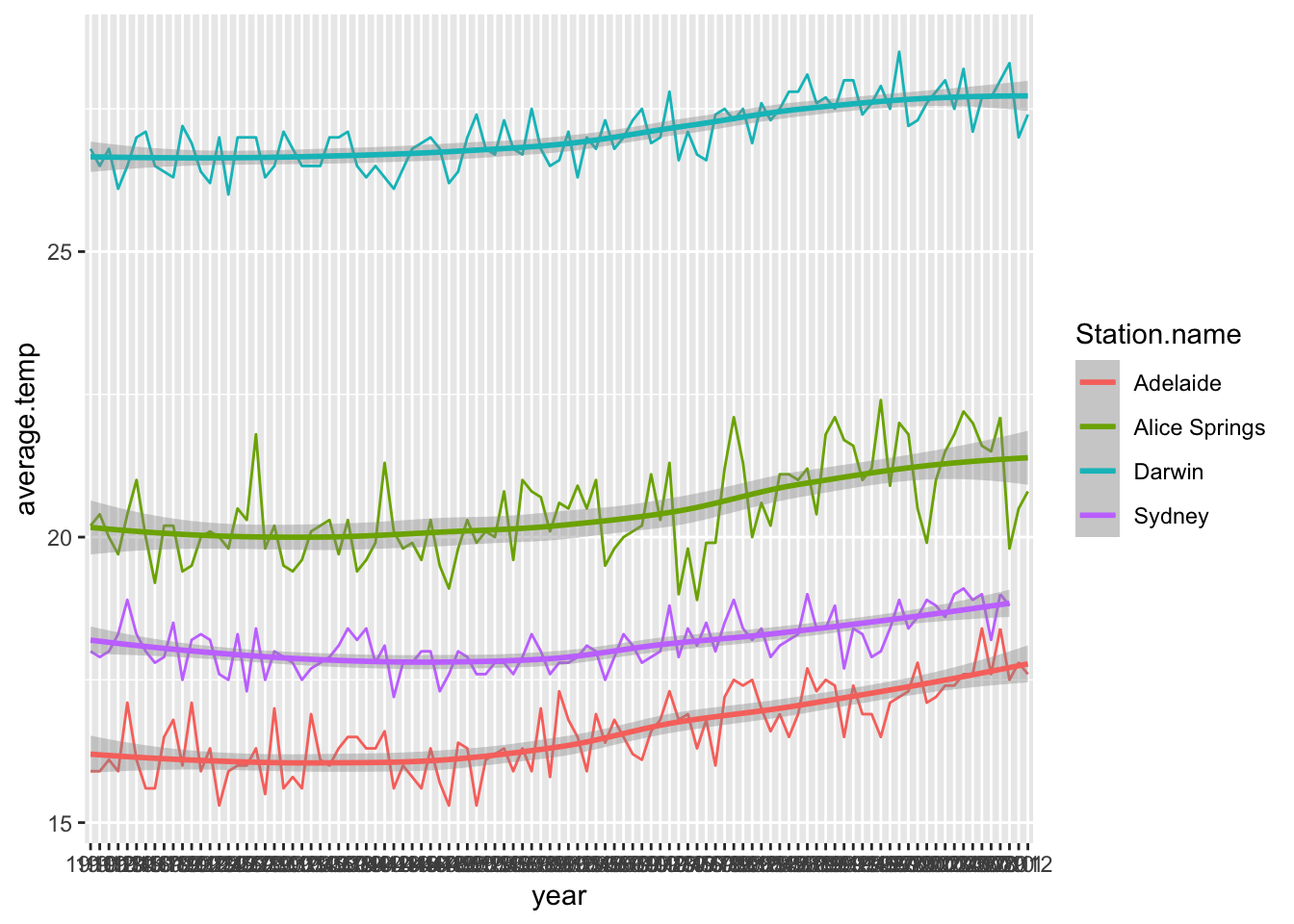
geom_smooth()is a new geometry function- This function puts a curve of best fit in our graph
sample_temperature %>%
  ggplot() +
  geom_line(aes(x = year,
                y = average.temp,
                color = Station.name,
                group = Station.name)) +
  geom_smooth(aes(x = year,
                  y = average.temp,
                  color = Station.name,
                  group = Station.name))
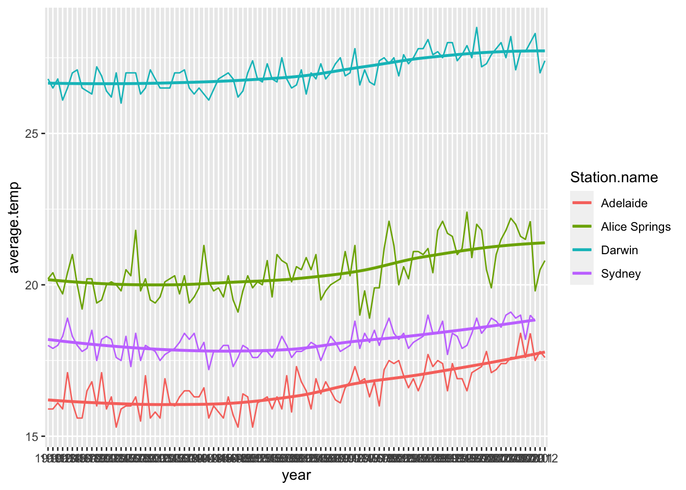
- We can remove the grey area representing standard error of our COBF by setting the
seargument to false
sample_temperature %>%
  ggplot() +
  geom_line(aes(x = year,
                y = average.temp,
                color = Station.name,
                group = Station.name)) +
  geom_smooth(aes(x = year,
                  y = average.temp,
                  color = Station.name,
                  group = Station.name),
              se = FALSE)
A Note on Aesthetics #
So far we have seen the aes() function as an argument of ‘geom’ functions, and we will continue to see this throughout this material. It is worth noting, however, that the aes() function can be used as an argument of ggplot() instead of the geom functions. As an example consider this plot with multiple geometries:
sample_data %>%
  ggplot() +
  geom_point(aes(x = V1,
                 y = V2)) +
  geom_line(aes(x = V1,
                y = V2))

This can be rewritten using only one use of aes() if we use it as an argument of ggplot() instead of both geom_point() and geom_line():
sample_data %>%
  ggplot(aes(x = V1,
             y = V2)) +
  geom_point() +
  geom_line()

We get the same effect. Note that if we then used aes() within geom_point() (for example), the new aesthetics we supply would override the ggplot() aesthetics.
Creating Bar and Column Graphs #
- There are two types of bar/column graph geometry functions we deal with:
geom_bar()geom_col()
geom_bar()
#
- For the
geom_bar()function, the user specifies anxvariable to graph, and the function takes theyvariable to be a count of observations of thex - This is similar to a histogram, only we usually use it for categorical variables
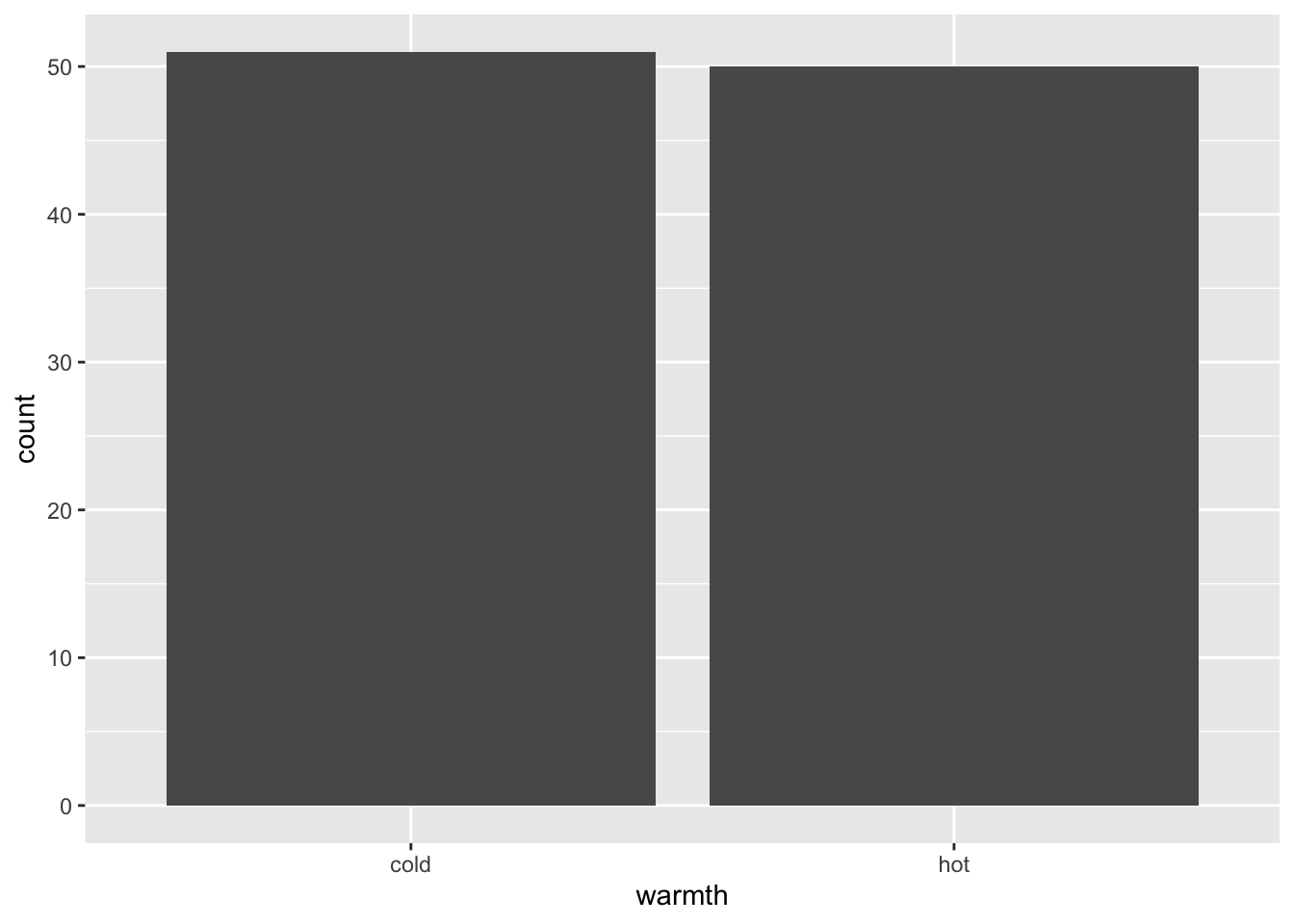
- Let’s demonstrate by classifing years in Sydney as hot, cold or moderate
hot_or_cold <- station_data %>%
  filter(Station.name == "Sydney") %>%
  mutate(warmth = ifelse(average.temp > 18, "hot", "cold"))
- We can then see how many of each day there are
hot_or_cold %>%
  ggplot() +
  geom_bar(aes(x = warmth))
geom_col()
#
- The
geom_col()function is more versatile, allowing the user to specify both andxandyvariable - The
xis usually categorical, and theyquantative
We introduce the Australian Environmental-Economic Accounts (2016) for our examples.
load("tidy_EnvAcc_data/consumption.rdata")
head(consumption, 12)
## # A tibble: 12 x 3
##    State year    water_consumption
##    <chr> <chr>               <dbl>
##  1 NSW   2008–09              4555
##  2 VIC   2008–09              2951
##  3 QLD   2008–09              3341
##  4 SA    2008–09              1179
##  5 WA    2008–09              1361
##  6 TAS   2008–09               466
##  7 NT    2008–09               160
##  8 ACT   2008–09                48
##  9 NSW   2009–10              4323
## 10 VIC   2009–10              2904
## 11 QLD   2009–10              3112
## 12 SA    2009–10              1110
consumption %>%
  ggplot() +
  geom_col(aes(x = year,
               y = water_consumption))
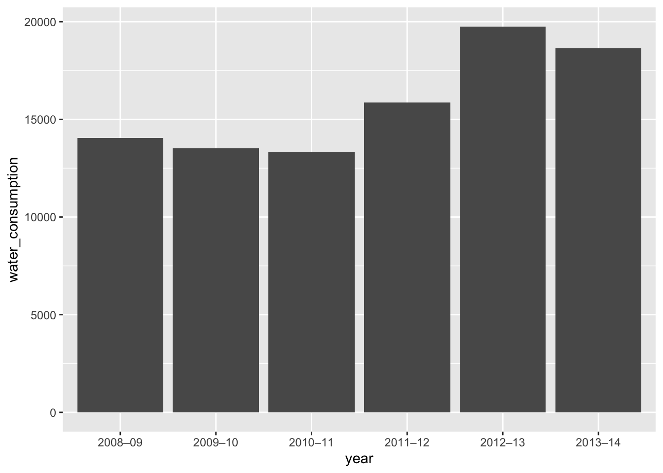
- Here we plot Australia’s total yearly water consumption
- If we wish to create a stacked column graph, we can try specifing the
colorargument ofaes()to colour by state
consumption %>%
  ggplot() +
  geom_col(aes(x = year,
               y = water_consumption,
               color = State))
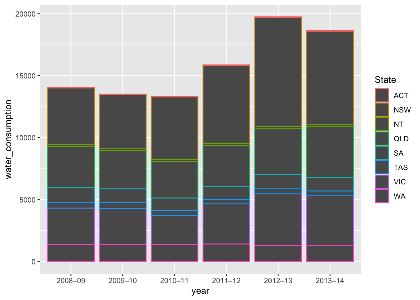
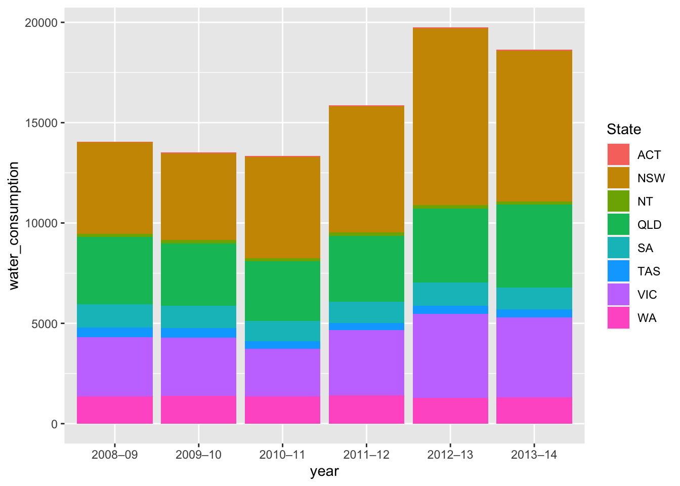
- This default, however, gives only an outline
- We can use the
fillargument to create solid colour
consumption %>%
  ggplot() +
  geom_col(aes(x = year,
               y = water_consumption,
               fill = State))
Creating Histograms #
- Histograms in
ggplotare very flexible - We use the
geom_histogram()function to specify a histogram geometry - We can then fine tune several arguments (Note: these are arguments of
geom_histogram(), and not aes())- The
xargument selects the variable to plot - The
binsargument can choose the number of bins we use OR - The
binwidthargument can specify the width of the bins we place our observations in - The
originargument specifies the number from which we begin setting bins and is only useful with thebinsargument
- The
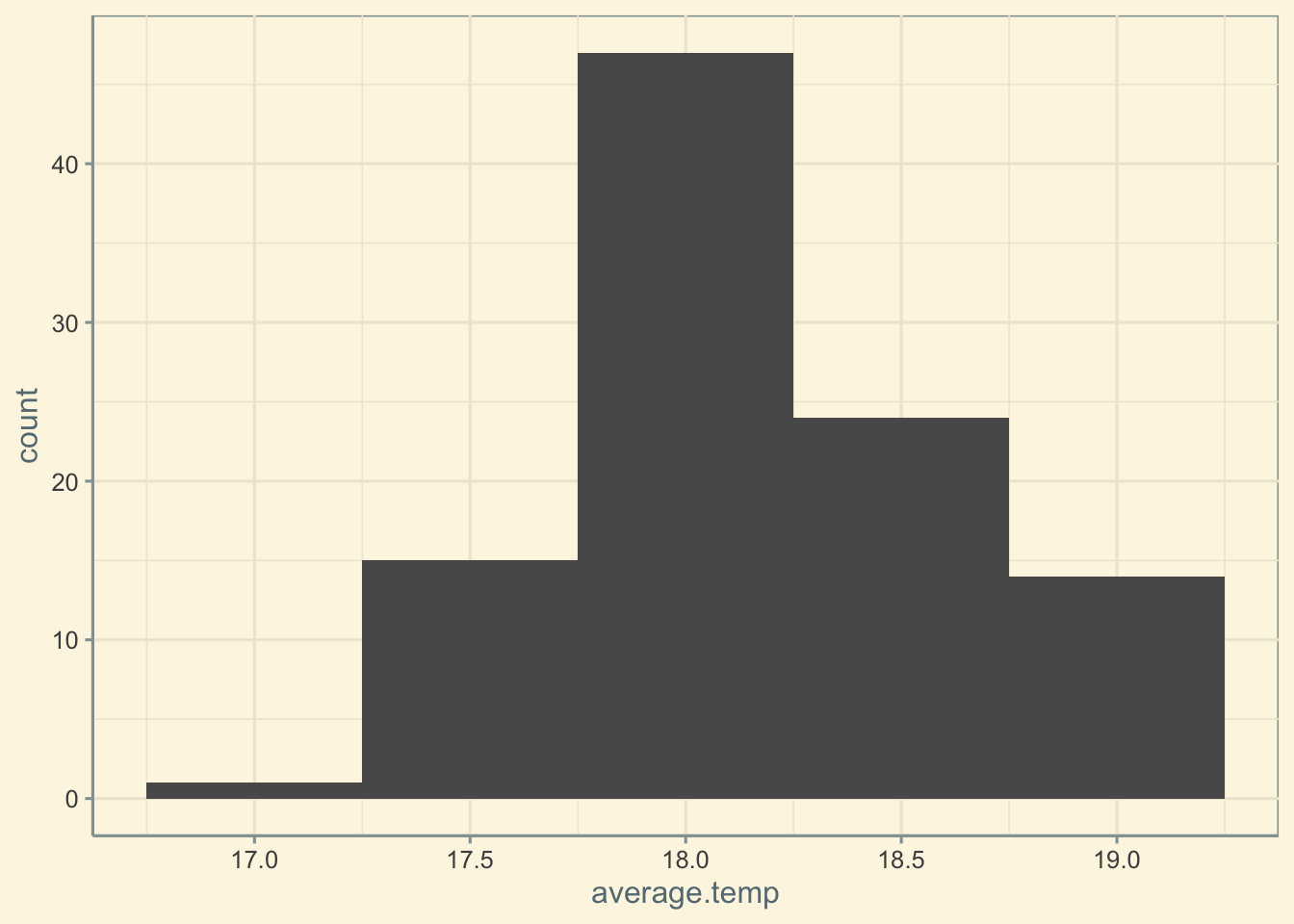
We again use annual temperatures in Sydney as an example.
- First try setting exactly 10 bins
station_data %>%
  filter(Station.name == "Sydney") %>%
  ggplot() +
  geom_histogram(aes(x = average.temp),
                 bins = 10)
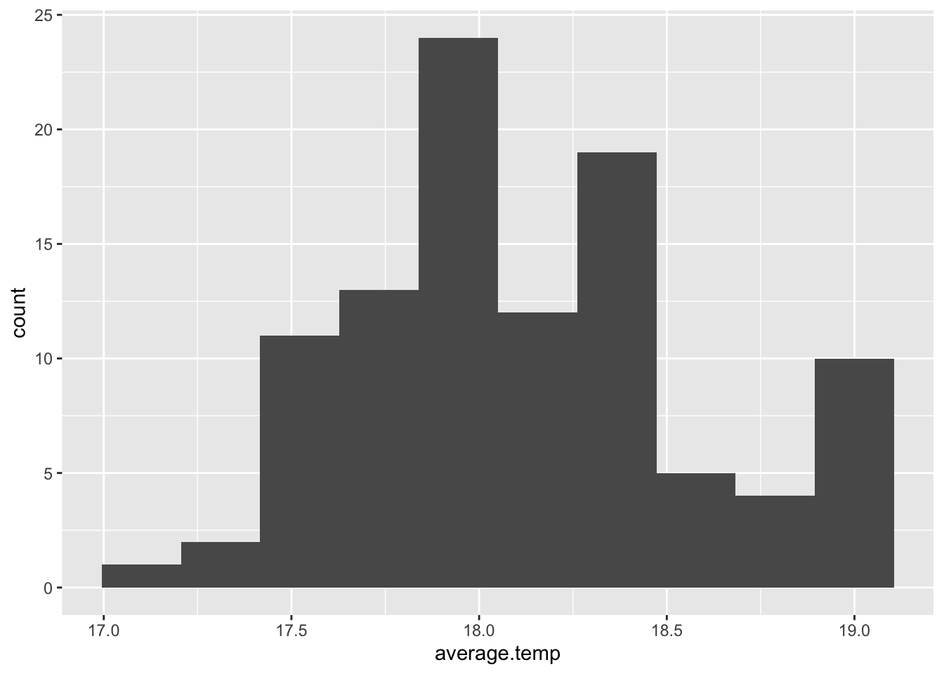
- We can see that our first bin begins slightly before 17 degrees
- If we wished, we could use
originto ensure the first bin begins counting from 16.5 degrees
station_data %>%
  filter(Station.name == "Sydney") %>%
  ggplot() +
  geom_histogram(aes(x = average.temp),
                 bins = 10,
                 origin = 16.5)
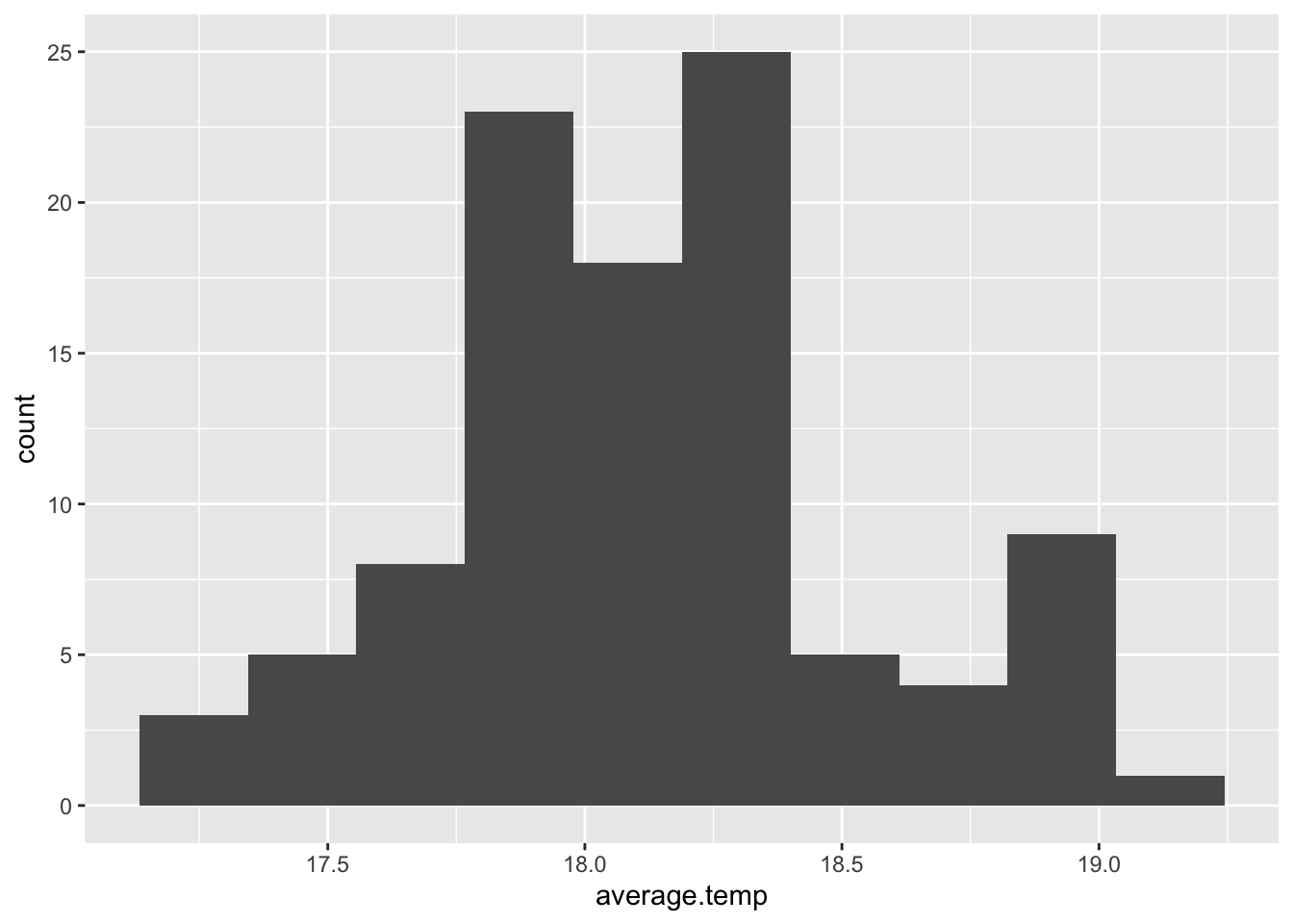
- We could also specify a binwidth width of 0.5 degrees, meaning one column represents all observations in a 0.5 degree range
station_data %>%
  filter(Station.name == "Sydney") %>%
  ggplot() +
  geom_histogram(aes(x = average.temp),
                     binwidth = 0.5)

Creating Boxplots #
- We use the
geom_boxplot()geometry function - The user specifies an
xand ayvariablexmust be a categorical variable
- This will automatically construct a boxplot for every different category of
xbased on the distribution of ourydata
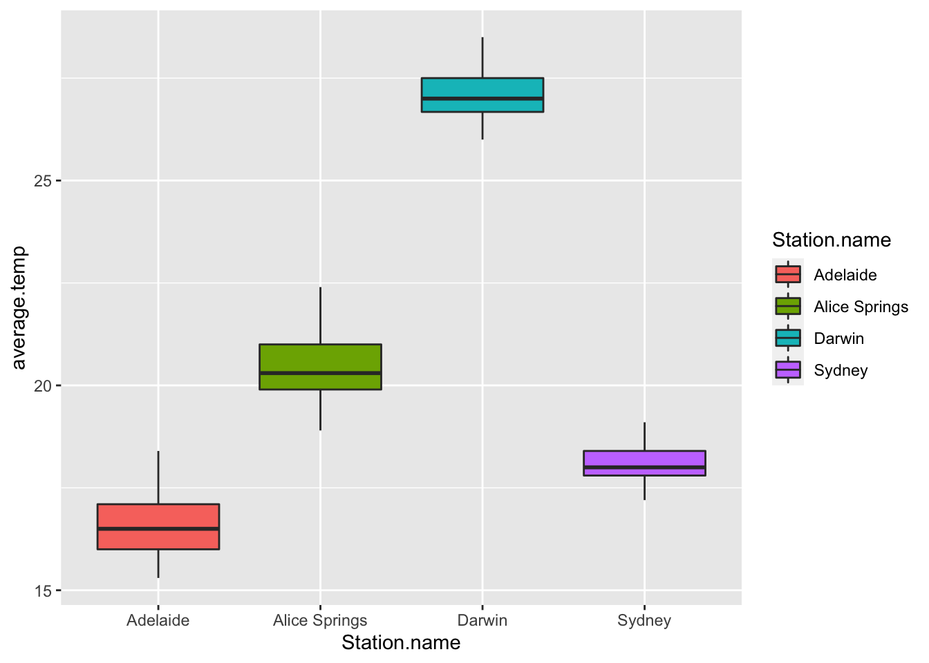
We can, as an example, examine how the average yearly temperatures of Sydney, Darwin, Adelaide and Alice Springs.
sample_temperature %>%
  ggplot() +
  geom_boxplot(aes(x = Station.name,
                   y = average.temp,
                   fill = Station.name))
The Precision of ggplot #
As was stated before, ggplot is a package which allows for extremely detailed tweaking of graphs. This includes the ability to modify, create and delete:
- The background colour of charts
- The grid lines thickness and colour
- The axis labels
- The axis scale
- The colours of any geometries
- The legend title
- The legend position
- Annotations
- Lines
- Titles and subtitles
We make such modifications using the theme() function. This function can take many different arguments:
plot.backgroundpanel.backgroundpanel.grid.majorpanel.grid.minorlegend.keyaxis.ticksaxis.title
Each relates to one element of a visualisation, and we consider each in turn.
Modifying Background Elements #
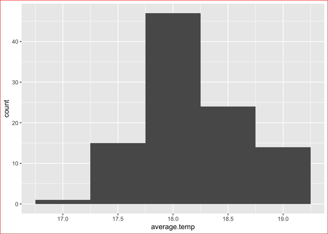
For our tweaking examples, we’ll use our histogram:
station_data %>%
  filter(Station.name == "Sydney") %>%
  ggplot() +
  geom_histogram(aes(x = average.temp),
                     binwidth = 0.5)

We introduce the theme() function and discover we can modify several elements.
The Plot Background colour #
- We use
plot.backgroundand set this to theelement_rect()function - This new function has the
colourargument which we can control, making the border a colour of our choice
station_data %>%
filter(Station.name == "Sydney") %>%
ggplot() +
geom_histogram(aes(x = average.temp),
binwidth = 0.5) +
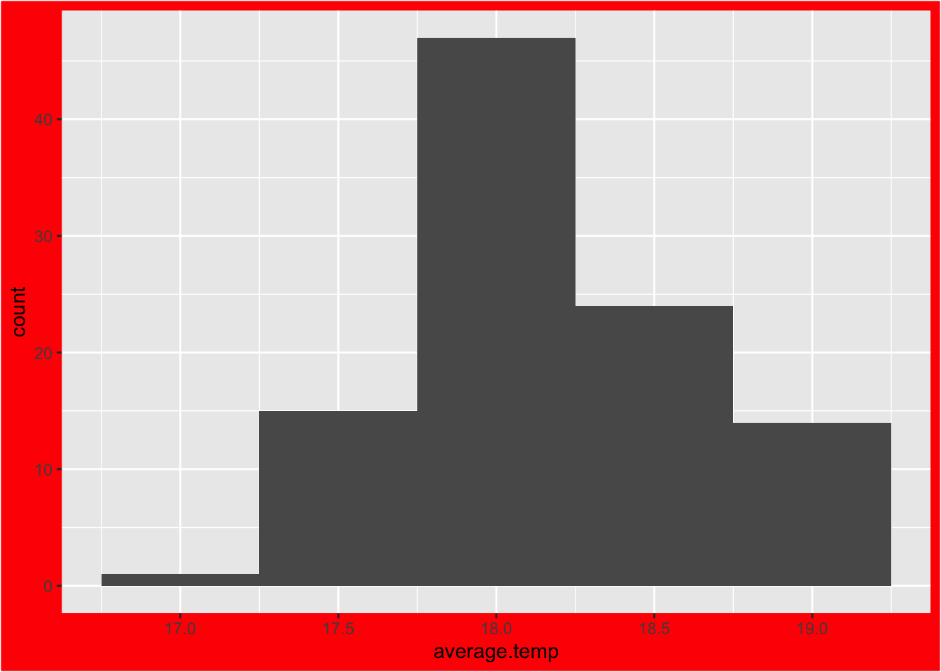
theme(plot.background = element_rect(colour = "red"))
- Or the
fillargument, which fills the entire background
station_data %>%
  filter(Station.name == "Sydney") %>%
  ggplot() +
  geom_histogram(aes(x = average.temp),
                     binwidth = 0.5) +
  theme(plot.background = element_rect(fill = "red"))
The Panel Background Colour #
- We use
panel.backgroundand set this to theelement_rect()function - Then again we have our options to
colourorfill
station_data %>%
filter(Station.name == "Sydney") %>%
ggplot() +
geom_histogram(aes(x = average.temp),
binwidth = 0.5) +
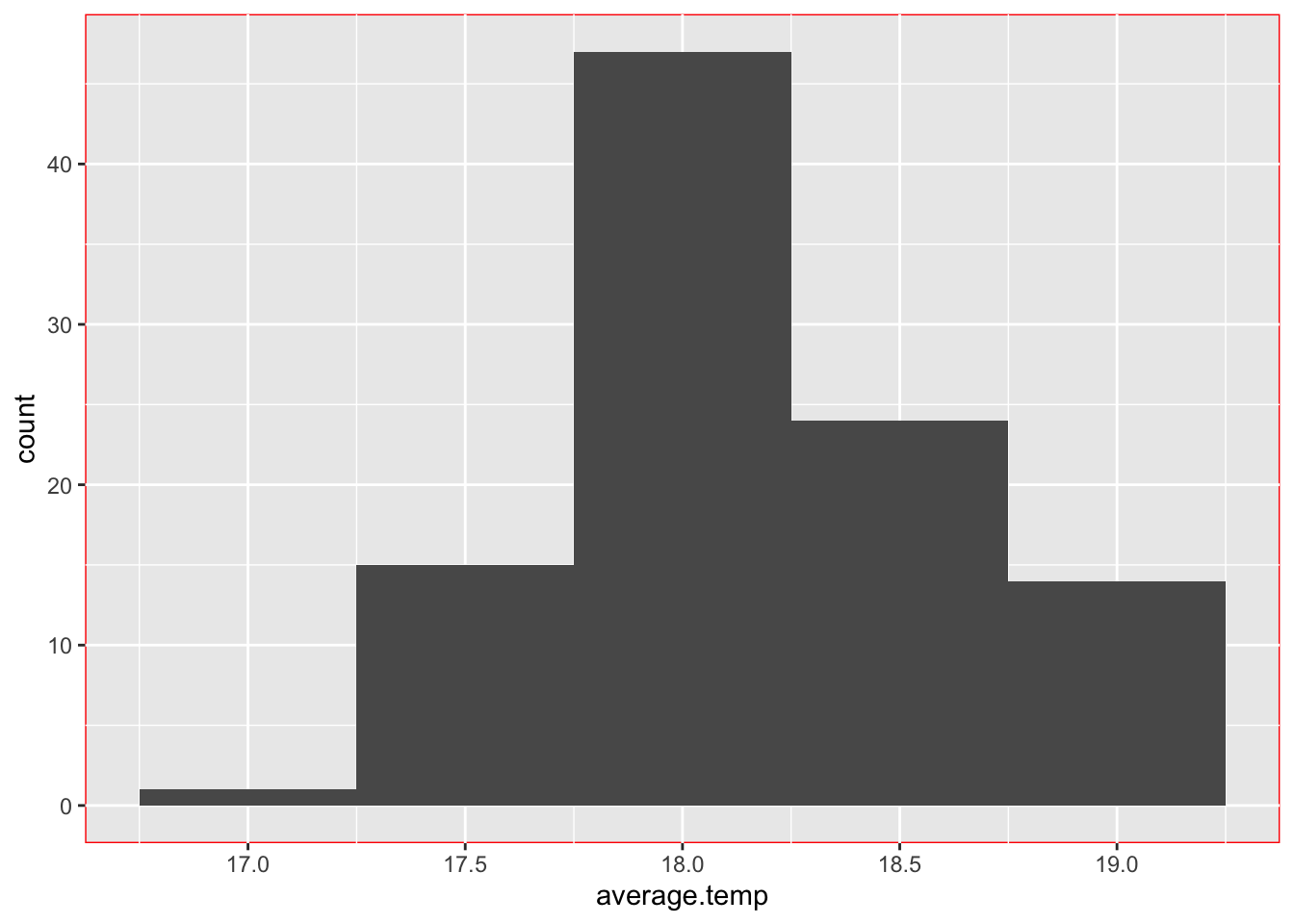
theme(panel.background = element_rect(colour = "red"))
Or…
station_data %>%
  filter(Station.name == "Sydney") %>%
  ggplot() +
  geom_histogram(aes(x = average.temp),
                     binwidth = 0.5) +
  theme(panel.background = element_rect(fill = "red"))
Grid Lines #
- We can also modify the grid lines we see on our charts
- There are two types of grid lines, major and minor
- They are modified using
panel.grid.majorandpanel.grid.minor - For each, we set them to the
element_line()function - This new function takes arguments of
colourandsize
Here are some examples:
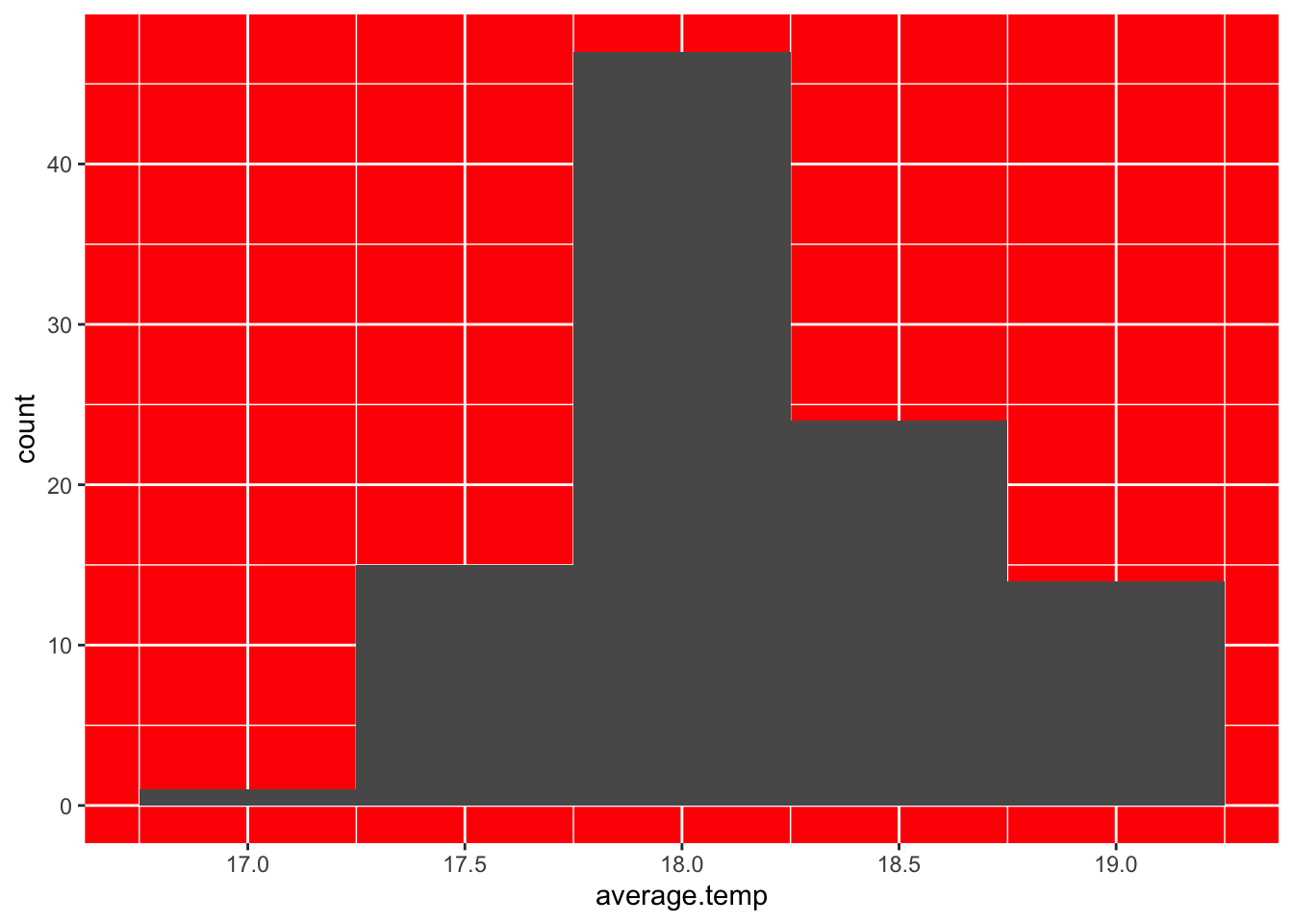
- Modifying major lines to be blue and very thick:
station_data %>%
  filter(Station.name == "Sydney") %>%
  ggplot() +
  geom_histogram(aes(x = average.temp),
                     binwidth = 0.5) +
  theme(panel.grid.major = element_line(colour = "blue",
                                        size = 5))
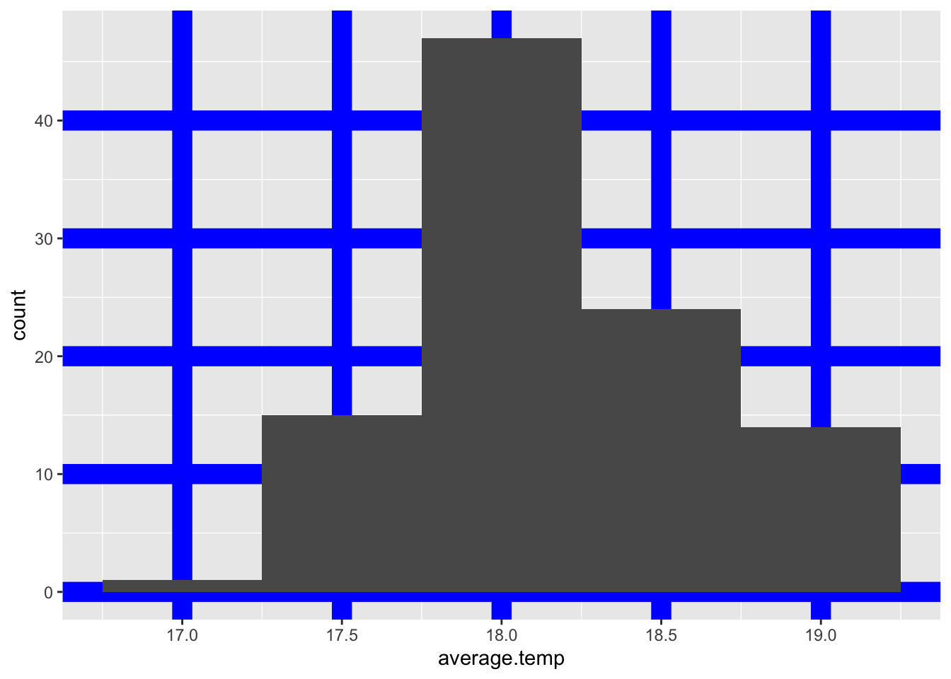
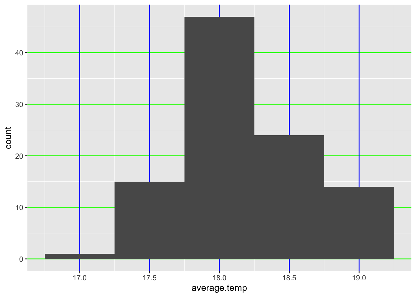
- Note: we can modify the vertical and horizontal major grid lines with
panel.grid.major.xandpanel.grid.major.yrespectively
station_data %>%
  filter(Station.name == "Sydney") %>%
  ggplot() +
  geom_histogram(aes(x = average.temp),
                     binwidth = 0.5) +
  theme(panel.grid.major.x = element_line(colour = "blue"),
        panel.grid.major.y = element_line(colour = "green"))
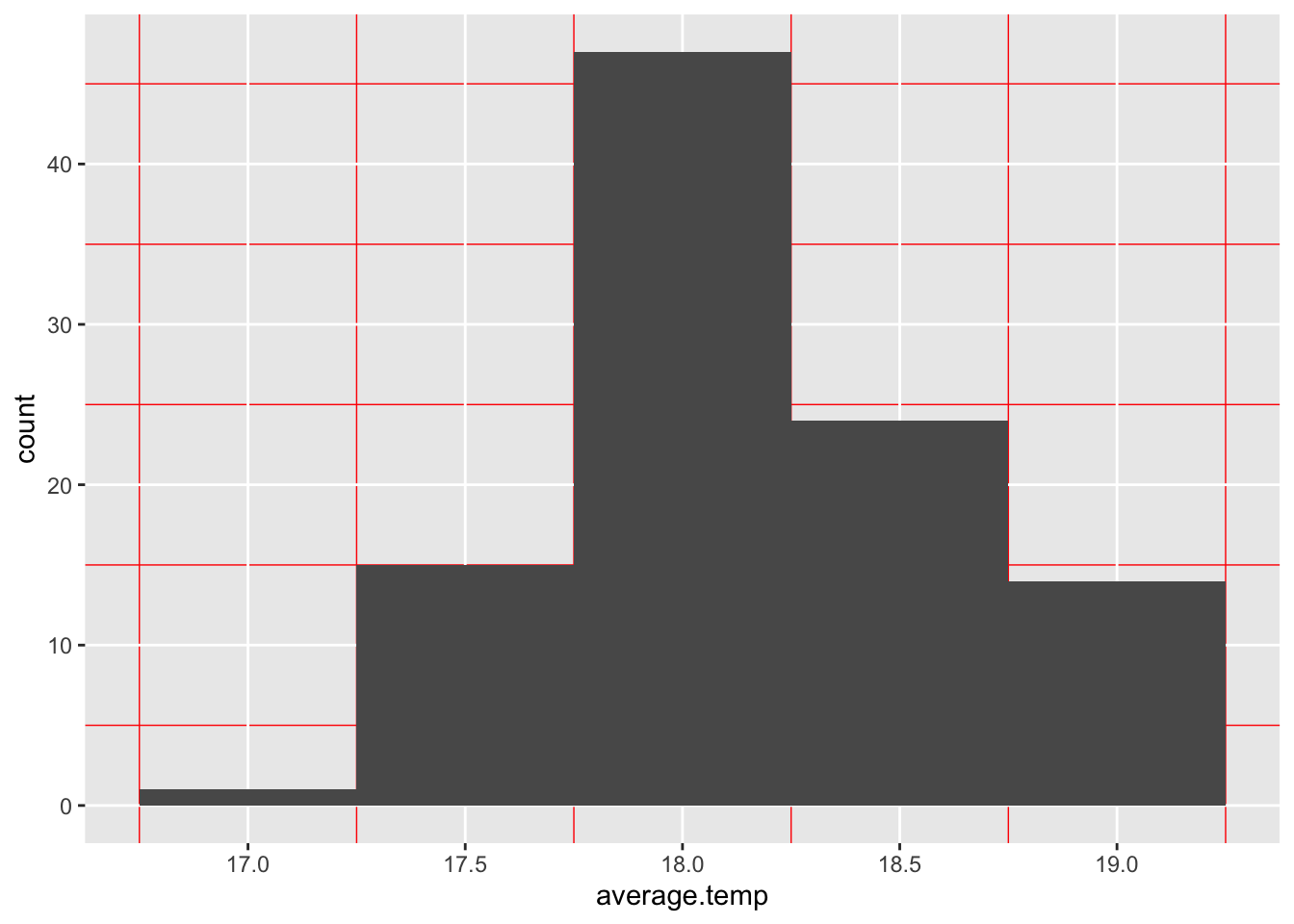
- Modifying minor lines:
station_data %>%
  filter(Station.name == "Sydney") %>%
  ggplot() +
  geom_histogram(aes(x = average.temp),
                     binwidth = 0.5) +
  theme(panel.grid.minor = element_line(colour = "red"))
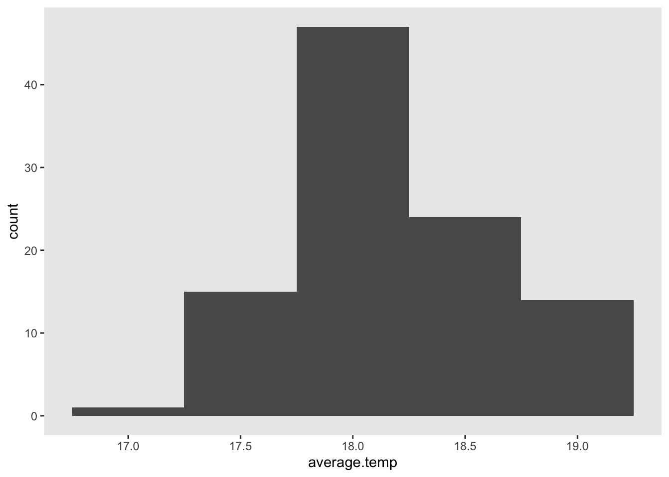
- If we wish, we can also totally remove an element (such as the grid lines)
- If we don’t want any gridlines, we set it to the
element_blank()function
station_data %>%
  filter(Station.name == "Sydney") %>%
  ggplot() +
  geom_histogram(aes(x = average.temp),
                     binwidth = 0.5) +
  theme(panel.grid.major = element_blank(),
        panel.grid.minor = element_blank())
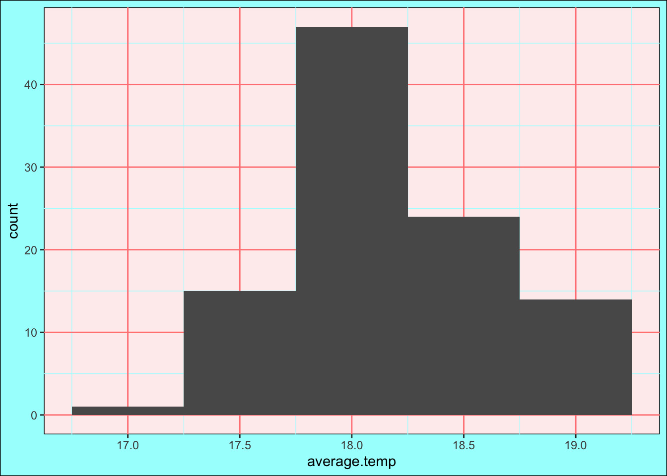
Get Creative! #
Combining all of these features can produce some cool looking graphs! If you have html colour codes, you can pick your own colours!
station_data %>%
  filter(Station.name == "Sydney") %>%
  ggplot() +
  geom_histogram(aes(x = average.temp),
                     binwidth = 0.5) +
  theme(plot.background = element_rect(colour = "#000000",
                                       fill = "#A6FEFD"),
        panel.background = element_rect(colour = "#000000",
                                        fill = "#FFEEEE"),
        panel.grid.major = element_line(size = 0.5,
                                        colour = "#FF8383"),
        panel.grid.minor = element_line(colour = "#B0FCFF"))
Modifying the Axes #
- We introduce two new types of functions
xlab()andylab()can change the labels of axesxlim()andylim()can change the range of what the axes display
It’s simple enough to change axis names:
station_data %>%
  filter(Station.name == "Sydney") %>%
  ggplot() +
  geom_histogram(aes(x = average.temp),
                     binwidth = 0.5) +
  xlab("Average Yearly Temp. (°C)") +
  ylab("Number of Observations (1910-2012")

As an example of axis range, observe contrast in the x-axis for the following:
sample_data %>%
  ggplot() +
  geom_point(aes(x = V1,
                 y = V2)) +
  geom_line(aes(x = V1,
                y = V2))

Versus…
sample_data %>%
  ggplot() +
  geom_point(aes(x = V1,
                 y = V2)) +
  geom_line(aes(x = V1,
                y = V2)) +
  xlim(0,5) +
  ylim(0,5)
We can also reduce the axis range, but this may cause a loss of data.
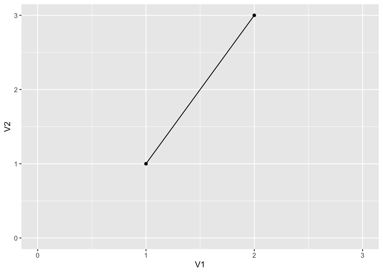
sample_data %>%
  ggplot() +
  geom_point(aes(x = V1,
                 y = V2)) +
  geom_line(aes(x = V1,
                y = V2)) +
  xlim(0,3) +
  ylim(0,3)
Changing Scale #
Finally, we can take care of this awfully scaled plot!
We introduce the concept of scale functions.
- There are very many, each with their own purpose, but they all generally modify the scales of our charts
- They are named by the convention “scale_name_datatype()”
- A
full list can be found here, but examples include:
scale_x_discrete()scale_y_continuous()scale_size_continuous()scale_fill_manual()scale_colour_gradient()- Etc…
- The arguments they take vary according to the function, but for now we are interested in:
name |
Changes axis names (just like xlab()) |
limits |
Changes the axis range with precise control |
breaks |
Change the way numbers are displayed on our scale with precise control |
\
First of all, we rename axes with name and rescale our range.
Note: limits and breaks take a vector of numbers as their value. We ususally use seq() to assign to breaks (specifying the start, end, and step-value) whilst we usually use a vector to assign to limits (specifying only a start and end value).
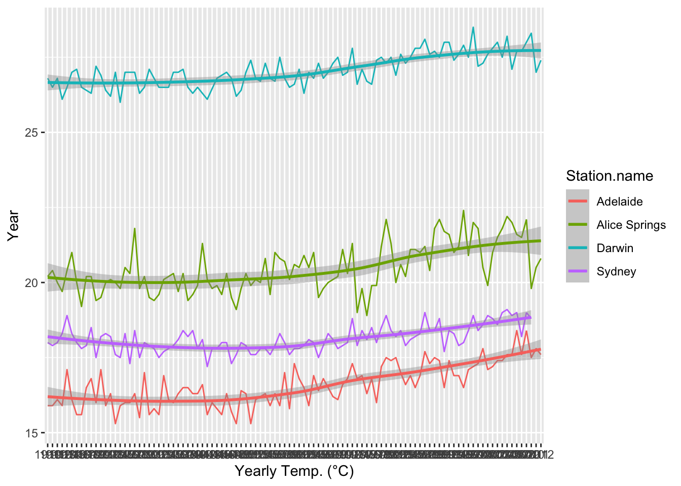
sample_temperature %>%
  ggplot() +
  geom_line(aes(x = year,
                y = average.temp,
                color = Station.name,
                group = Station.name)) +
  geom_smooth(aes(x = year,
                  y = average.temp,
                  color = Station.name,
                  group = Station.name)) +
  scale_x_discrete(name = "Year",
                   breaks = seq(1910, 2012, 10)) +
  scale_y_continuous(name = "Yearly Temp. (°C)",
                     limits = c(15, 30))
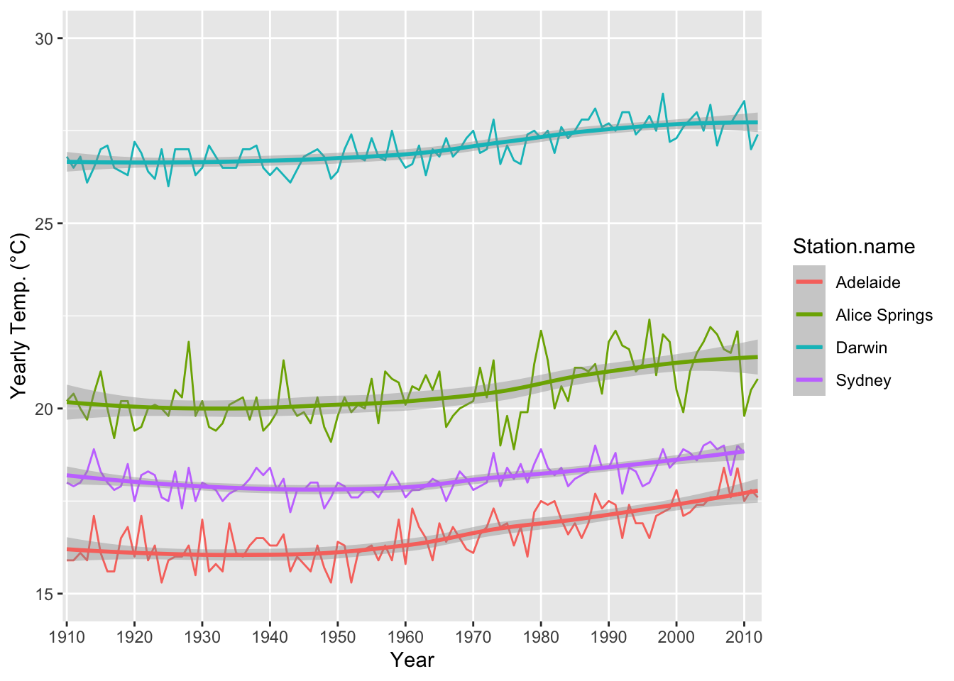
Now this looks much nicer!
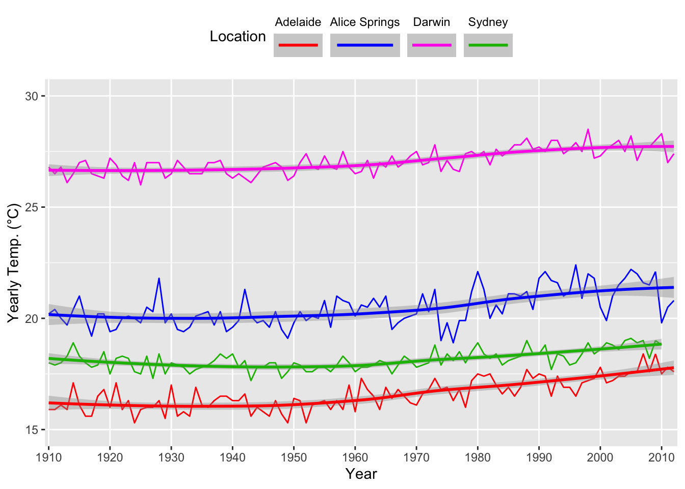
Custom Colours and Cleaner Legends #
- Sometimes automatically generated legends aren’t exactly what we want
- We can add the
scale_fill_manual()orscale_colour_manual()functions to our plot to fine tune it- Which do we use? If we colour our data using the
fillargument, use the first, and if we colour our data using thecolourargument, use the second
- Which do we use? If we colour our data using the
- This function has two important arguments –
valuesandguide - The
valuesfunction takes a vector of colours and can be used to create custom colours in a chart
sample_temperature %>%
  ggplot() +
  geom_line(aes(x = year,
                y = average.temp,
                color = Station.name,
                group = Station.name)) +
  geom_smooth(aes(x = year,
                  y = average.temp,
                  color = Station.name,
                  group = Station.name)) +
  scale_x_discrete(name = "Year",
                   breaks = seq(1910, 2012, 10)) +
  scale_y_continuous(name = "Yearly Temp. (°C)",
                     limits = c(15, 30)) +
  scale_colour_manual(values = c("#FF0000", "#0031FF", "#FF00EB", "#13BB00"))
Functions within functions #
The guide argument of the above two functions itself takes a function as its value. The function is called guide_legend().
- These are the arguments of
guide_legend():
title |
Changes legend title |
nrow |
Changes how many rows the legend uses to display data |
label.position |
Changes where the label title appears in the legend |
keywidth |
Numeric argument to modify the width of legend boxes |
legend.key |
Takes value of a vector of colours and specifies custom colours |
\
Let’s use all of the above on our chart.
- We set the title to “Location”
- We display the data in two rows
- We put the legend label (here the location name) to the left
- We specify a width of 2.5
sample_temperature %>%
  ggplot() +
  geom_line(aes(x = year,
                y = average.temp,
                color = Station.name,
                group = Station.name)) +
  geom_smooth(aes(x = year,
                  y = average.temp,
                  color = Station.name,
                  group = Station.name)) +
  scale_x_discrete(name = "Year",
                   breaks = seq(1910, 2012, 10)) +
  scale_y_continuous(name = "Yearly Temp. (°C)",
                     limits = c(15, 30)) +
  scale_colour_manual(values = c("#FF0000", "#0031FF", "#FF00EB", "#13BB00"),
                    guide = guide_legend(title = "Location",
                                         nrow = 2,
                                         label.position = "top",
                                         keywidth = 2.5))
- We note we can also use the
legend.positionargument of thetheme()function to change where our legend is
sample_temperature %>%
  ggplot() +
  geom_line(aes(x = year,
                y = average.temp,
                color = Station.name,
                group = Station.name)) +
  geom_smooth(aes(x = year,
                  y = average.temp,
                  color = Station.name,
                  group = Station.name)) +
  scale_x_discrete(name = "Year",
                   breaks = seq(1910, 2012, 10)) +
  scale_y_continuous(name = "Yearly Temp. (°C)",
                     limits = c(15, 30)) +
  scale_colour_manual(values = c("#FF0000", "#0031FF", "#FF00EB", "#13BB00"),
                    guide = guide_legend(title = "Location",
                                         nrow = 1,
                                         label.position = "top",
                                         keywidth = 2.5)) +
  theme(legend.position = "top")
Note: legend.position= "none" removes a legend entirely.
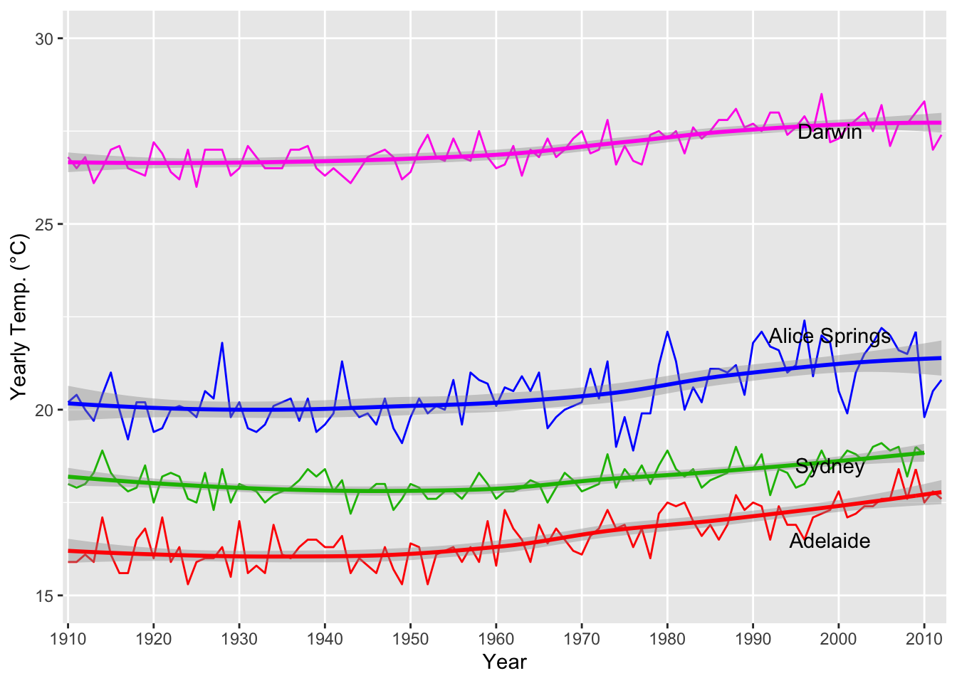
Annotations #
- To annotate we use the
annotate()function - Note: the first argument of this function must be “text”
- It also takes the
labelargument, being the text of your annotation - In addition, the
xandyarguments for position on a chart
sample_temperature %>%
  ggplot() +
  geom_line(aes(x = year,
                y = average.temp,
                color = Station.name,
                group = Station.name)) +
  geom_smooth(aes(x = year,
                  y = average.temp,
                  color = Station.name,
                  group = Station.name)) +
  scale_x_discrete(name = "Year",
                   breaks = seq(1910, 2012, 10)) +
  scale_y_continuous(name = "Yearly Temp. (°C)",
                     limits = c(15, 30)) +
  scale_colour_manual(values = c("#FF0000", "#0031FF", "#FF00EB", "#13BB00")) +
  theme(legend.position = "none") +
  annotate("text",
           label = "Adelaide",
           x = 90,
           y = 16.5) +
  annotate("text",
           label = "Sydney",
           x = 90,
           y = 18.5) +
  annotate("text",
           label = "Alice Springs",
           x = 90,
           y = 22) +
  annotate("text",
           label = "Darwin",
           x = 90,
           y = 27.5)
- We can also add lines in as we please using the
geom_hline()orgeom_vline()functions - These only take the
yinterceptorxinterceptfunctions respectively and can be used to place lines at any point on a chart
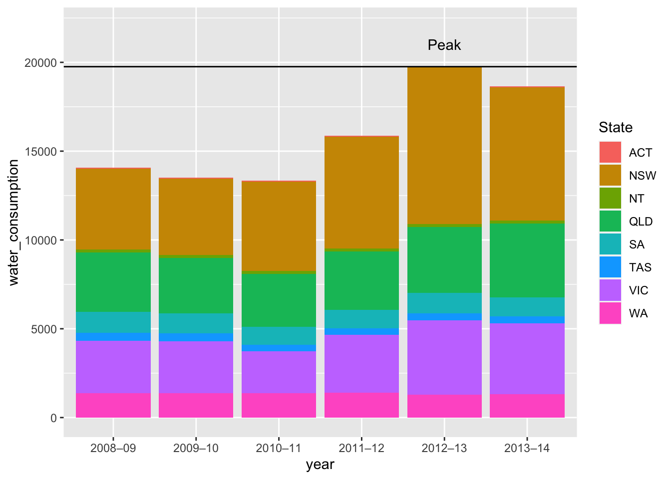
consumption %>%
  ggplot() +
  geom_col(aes(x = year,
               y = water_consumption,
               fill = State)) +
  ylim(0,22000) +
  annotate("text",
           label = "Peak",
           x = 5,
           y = 21000) +
  geom_hline(yintercept = 19756)
Titles #
- For titles we use
ggtitle() - For subtitles we use the
subtitleargument ofggtitle()
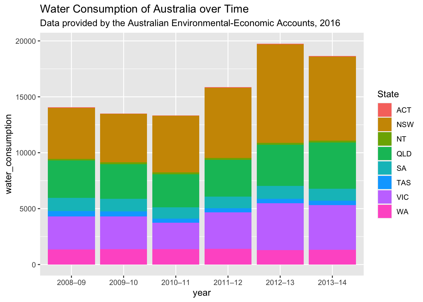
consumption %>%
  ggplot() +
  geom_col(aes(x = year,
               y = water_consumption,
               fill = State)) +
  ggtitle("Water Consumption of Australia over Time",
          subtitle = "Data provided by the Australian Environmental-Economic Accounts, 2016")
Predefined Themes #
- In as much as we have precise customisation available in ggplot, sometimes we may not want to bother
- We can automatically modify graphs we’ve made using pre-constructed themes from ggplot, using set theme functions as such
library("ggthemes")

station_data %>%
  filter(Station.name == "Sydney") %>%
  ggplot() +
  geom_histogram(aes(x = average.temp),
                     binwidth = 0.5) +
  theme_solarized()
- Some themes included in standard
ggplot:theme_bw()theme_dark()theme_void()theme_minimal()
- Some themes included in the
ggthemespackage (must be installed and library’d)theme_solarized()theme_excel()theme_wsi()theme_economist()theme_fivethirtyeight()
- Here are the ggplot themes, and here are the ggthemes themes
A Useful Link #
Here’s the ggplot Cheat Sheet published by R Studio!
Mapping with ggplot and ggmap #
ggplotand its sibling packageggmapare used to render maps and map-based charts in R- This includes the ability to make, among other things:
- Regular maps
- Geoplots
- Choropleths
- ggmap communicates with Google Maps, and functions by using an API key (Application Programming Interface key) to request access to Google’s maps
Unfortunately, as of June 2018, Google updated its policy on API keys, significantly limiting the capabilities of ggmap for individuals who have not signed up to Google APIs with billing details. As a result the content of Section 4 is not considered in this course.
ggplot Challenge #
The LindedIn Learning tutorial provides a practice dataset, along with a challenge. Given the dataset, the challenge is:
- Plot a map of all schools in California
- Colour the points based on their Institutional Control
- Change the size of the points to reflect their Undergraduate Population
Good luck!